Case studyAnita

Before, struck: Fragmented search results. After: Structured evidence

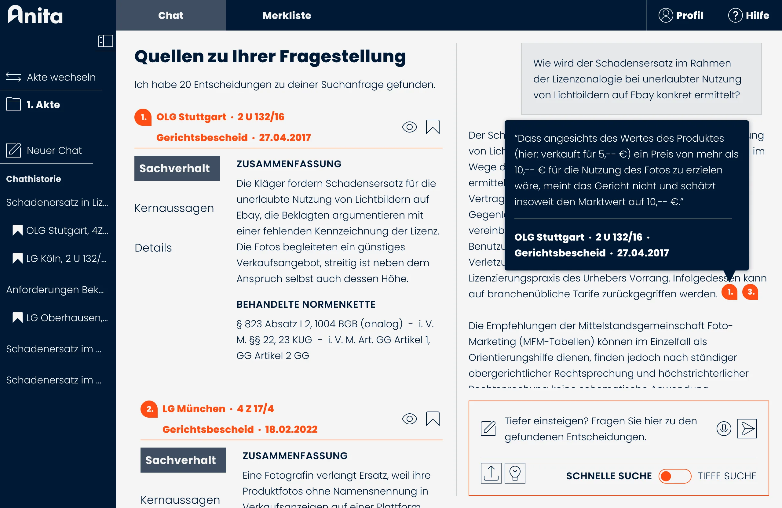
Anita results and chat, October 2025: the quote from the cited court decision in its hover state
10.2025 · Every claim in the answer leads back to the court decision it cites.

0 → 700+paying customers

Role
Product Designer (Freelance)
Period
Since 2024
Partner
Anita · Silicon Allee by Fraunhofer HHI
Scope
Core search redesign, information architecture overhaul, AI chatbot integration, brand-aligned product redesign

01 / 04

Assumption, struck: Two search bars: the facts and the argument.

One search field, the way lawyers already search.

The dual search bar asked for a factual description and an argument at the same time. Better instructions, new placeholder texts and a different weighting of the two fields changed nothing.

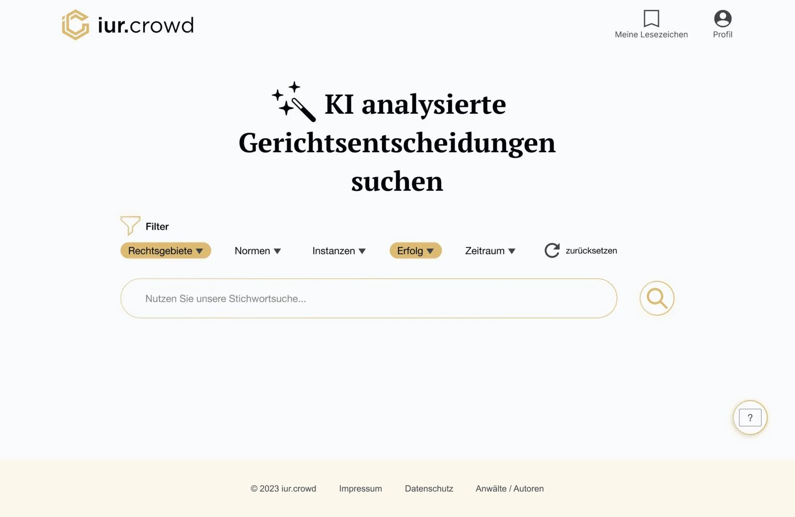
The concept was wrong, not its execution: users do not formulate arguments upfront. We removed the second field and rebuilt the information architecture and the results around a single entry point.
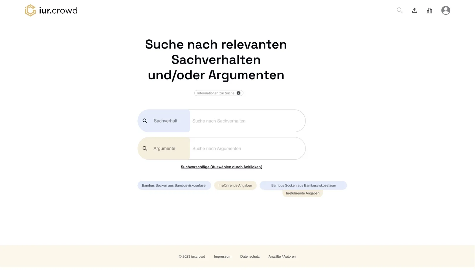
Home screen of Anita, then still called iur.crowd, January 2024: two search fields, facts and arguments
01.2024 · Two fields, no hint what goes where.
iur.crowd home screen, March 2024: one search field with filters above
03.2024 · One field, filters when needed.
“Am I supposed to search for two things at once?”

Participant, usability test 2024

2.8 / 7Satisfaction before the change.
205 error points across 6 participants.

5.0 / 7Satisfaction after the iteration round.
+79 % after the first 12 weeks.
02 / 04

Our own decision, struck: A map of every court decision’s argument.

Dependable orientation over a structure we could only guess.

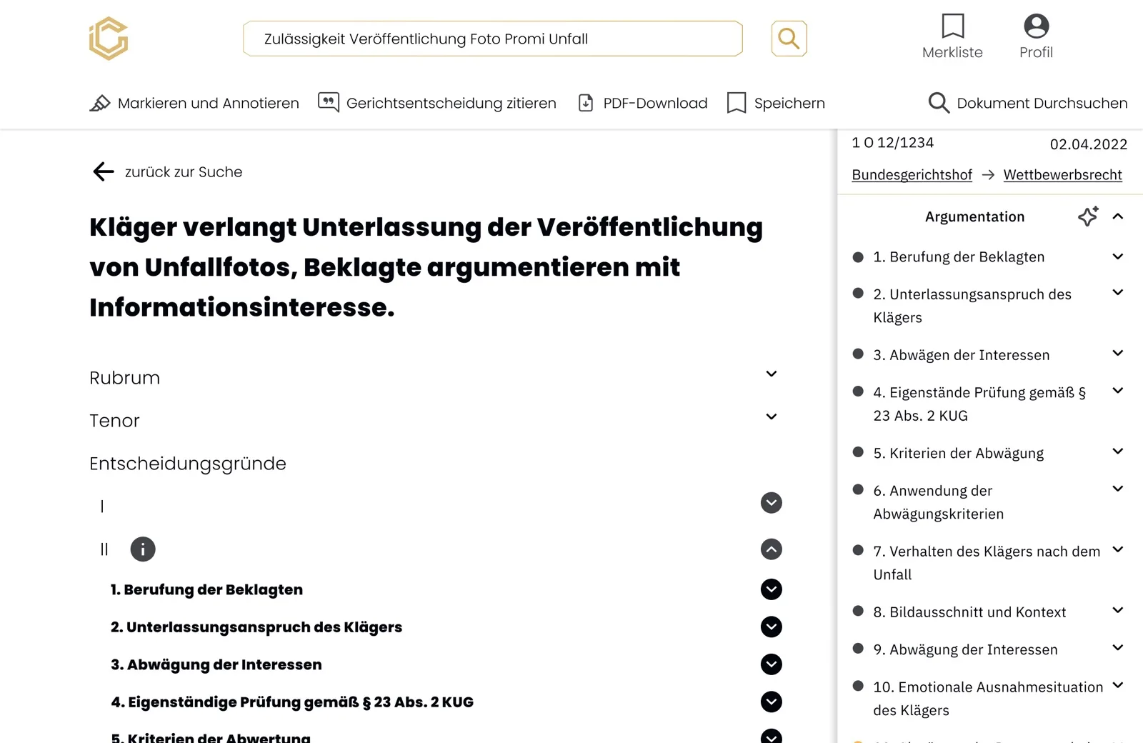
We extracted the reasoning of each court decision into argument segments and put them in a navigation bar. German decisions follow no shared structure, so the extraction was unstable from court to court.

Users had to read two layers, the text and our guess at it, and could not trust the second one. Partial structure without full reliability harms more than it helps. That shaped the next turn of the product.

Prototype, October 2024: a court decision page structured into its arguments
Prototype 10.2024 · The decision split into its arguments.

03 / 04

Simplicity as a product principle.

Within the Silicon Allee accelerator, supported by Fraunhofer HHI, iur.crowd was repositioned and rebranded as Anita. Khaled Mahd, Creative Director at Silicon Allee, led the rebrand toward a classic identity that does not follow current visual trends, with simplicity at its core.

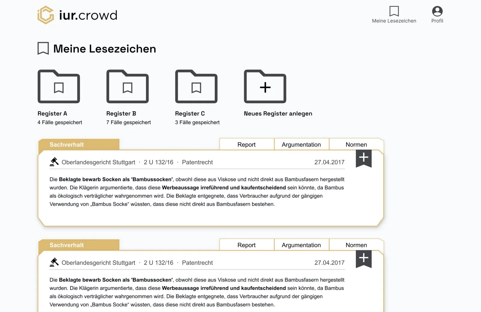
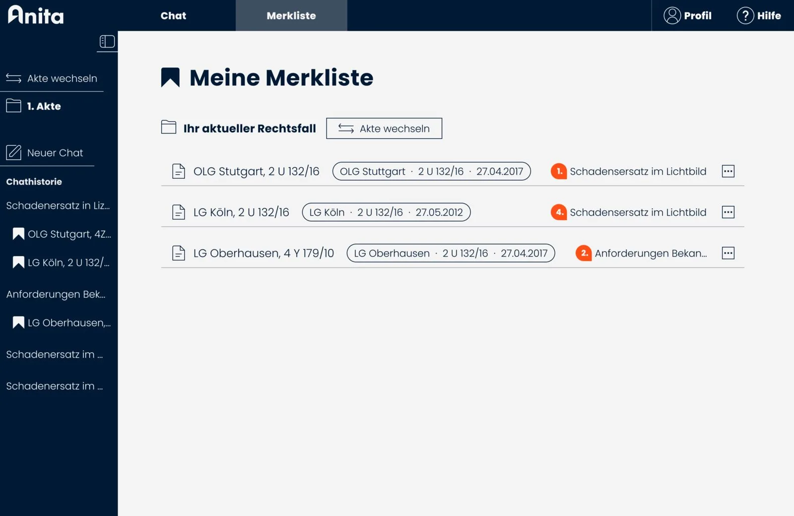
Together with him, I redesigned the app from the ground up. Simplicity became a rule for every screen: the bookmark list went from folders and cards to a plain list.

iur.crowd bookmark list, February 2024: folders and saved decisions as cards
iur.crowd 02.2024 · The bookmark list.
Anita bookmark list, October 2025: saved decisions as a plain list under the dark navigation
Anita 10.2025 · The list under the new brand.

04 / 04

Earlier version, struck: Summaries alone.

An answer built from the decisions’ own words.

Even with improved search, users struggled to see how individual court decisions related to their query. Without interpretation, results stayed fragmented, and checking each decision’s relevance meant reading it in full.

The chatbot extracts the quotes from the decisions it found and builds its answer from them. Source markers in the answer point back to those decisions: hovering one shows the quote the statement rests on and marks the decision in the source list.

Participants called it an “evidence layer”: trust came from being able to check, not from the summary. The first versions put too much on the screen at once. Later rounds made the answer easier to read, paced how it appears and tightened the source references.

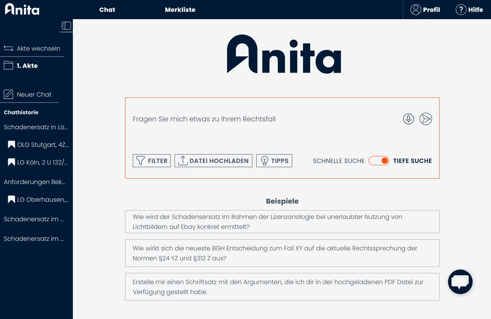
Anita home screen, October 2025, with the chat entry
10.2025 · The app with its chatbot patterns.
Anita results and chat, October 2025: the quote from the cited court decision in its hover state
10.2025 · The quote from the cited decision in its hover state.

All participants perceive the sources as evidence for the chatbot’s answer.Usability test, summer 2025

Key learnings

  1. Fix the interaction before scaling the system

    A flawed core interaction cannot be compensated by additional features. The dual search bar failed not because users lacked understanding, but because it contradicted their natural workflow. If users cannot start a task smoothly, every downstream improvement remains ineffective.

  2. Unreliable structure undermines trust

    Extracting judicial reasoning promised orientation, but inconsistent document structures made the system fragile. When a feature appears systematic yet behaves unpredictably, it increases cognitive load instead of reducing it. In high-stakes domains, perceived precision must equal actual reliability.

  3. Simplicity requires strategic restraint

    The rebranding to Anita sharpened a principle that had already emerged: simplicity is not visual reduction, but disciplined decision-making. Every element must justify its existence. Every layer must lower friction. Clarity is a product decision, not a visual trend.

  4. AI must reduce cognitive load to create value

    The chatbot succeeded when it acted as an interpretive bridge. A summary alone was not enough. Trust grew when each statement was built from a quote and its marker led to the decision it came from: the answer became checkable. AI created impact through contextualization and evidence.

  5. Research must guide direction changes

    User testing did not only validate improvements. It invalidated entire concepts. Abandoning structured argument extraction and dropping the dual search bar were not setbacks, but strategic corrections. Design maturity includes knowing when to stop.

Til Bußmann-Welsch
“Sören turned our SaaS product inside out. His read on its weaknesses and strengths was brutally honest, and that was exactly what it took to lift the product to the next level. He never lost sight of the technical side or the business side. Two years of progress speak for themselves.”

Let’s get together.

We can talk about your product, design or whatever is on your mind.

Make a choice.

Let’s have a chat