Project goal
Create a responsive web app that provides property buyers with information on properties of interest.
Project summary
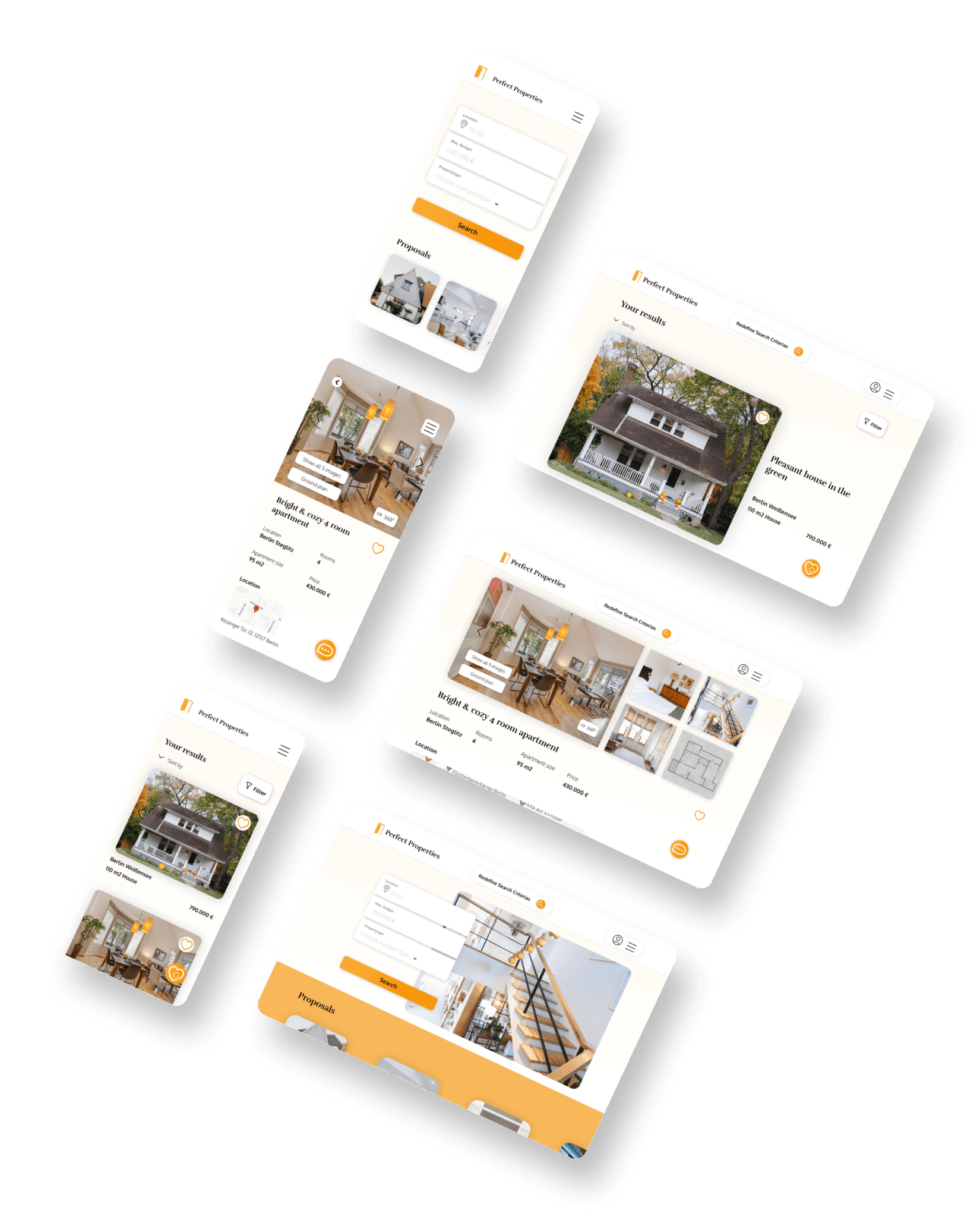
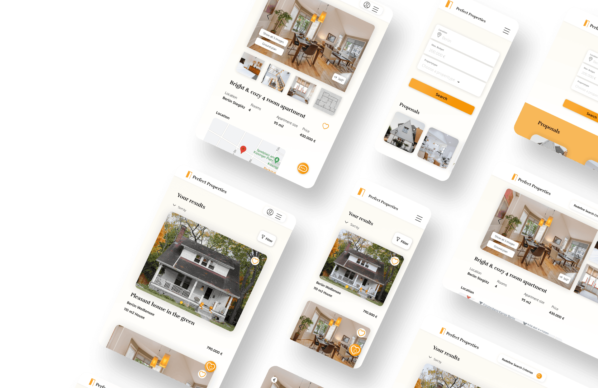
Based on given user research, the goal was to create a visual concept to meet the goals of our user persona. The process to the final responsive design was started by a mood board and the created wireframes were more and more defined with a proper typography, color scheme and some animations. After translating the mobile design to bigger devices, the creation of a style guide captured the visual communication of Perfect Properties.
February 2023 - April 2023
Careerfoundry UI Specialization
Responsive Design
Mobile-first approach
General Info
Process
Composition
Visual Design
Prototyping
Handoff
Figma
Roles
Tools
01 Initial Information
PreDefined Persona
As the course was focused on the UI, an user persona was already defined.

Rashida -
Mother & IT Consultant
Rashida -
Mother & IT Consultant
42 years old
She / her
Toulouse, France
IT Consultant
Married with 2 children
About
Quotes
As an IT consultant for a growing tech company, Rashida is frequently on the go, and often holds meetings by phone in her car while driving. She is good at multitasking and as she relies heavily on technology to help her with this, she is always on top of the latest trends.
As an IT consultant for a growing tech company, Rashida is frequently on the go, and often holds meetings by phone in her car while driving. She is good at multitasking and as she relies heavily on technology to help her with this, she is always on top of the latest trends.
I want to provide my family with financial security. I’ve been considering buying property for a while, and am looking for a tool that can help me find what I’m looking for, quickly!
“
“
Goals
Rashida makes a good living and wants to invest in property beyond the city for increased financial security for her family.
She wants to find the right information for fast decision-making.
She wants a tool to help her find the right properties so as not to waste her time.
02 Visual Direction
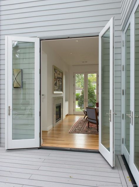
Using the given UX insights from our user persona Rashida, creating mood boards was the first step to find a visual direction.
Mood board

“Quick transparent
insights into a home feeling”
Fast
Clean
Welcoming
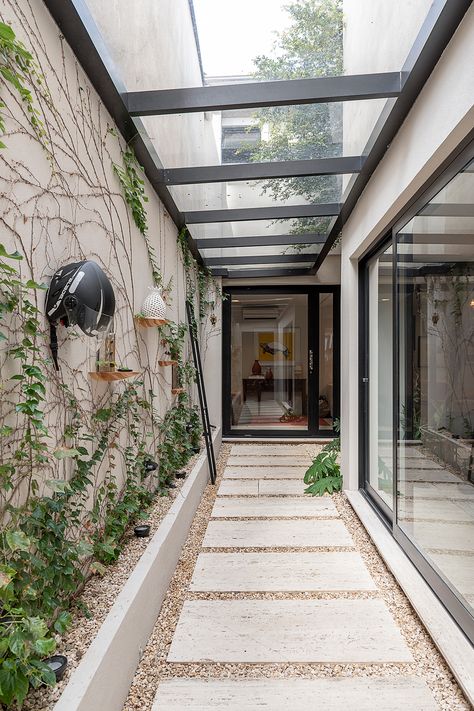
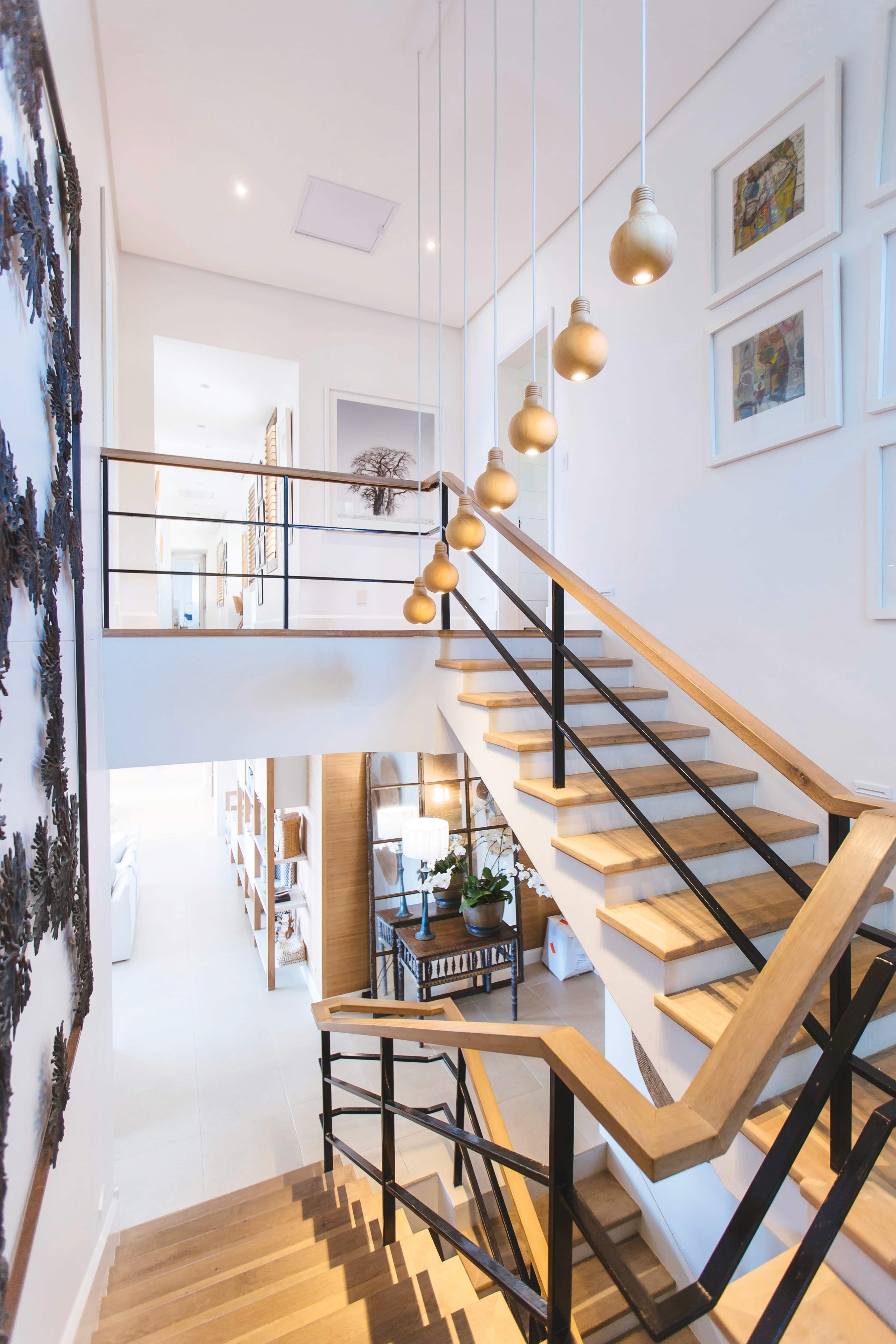
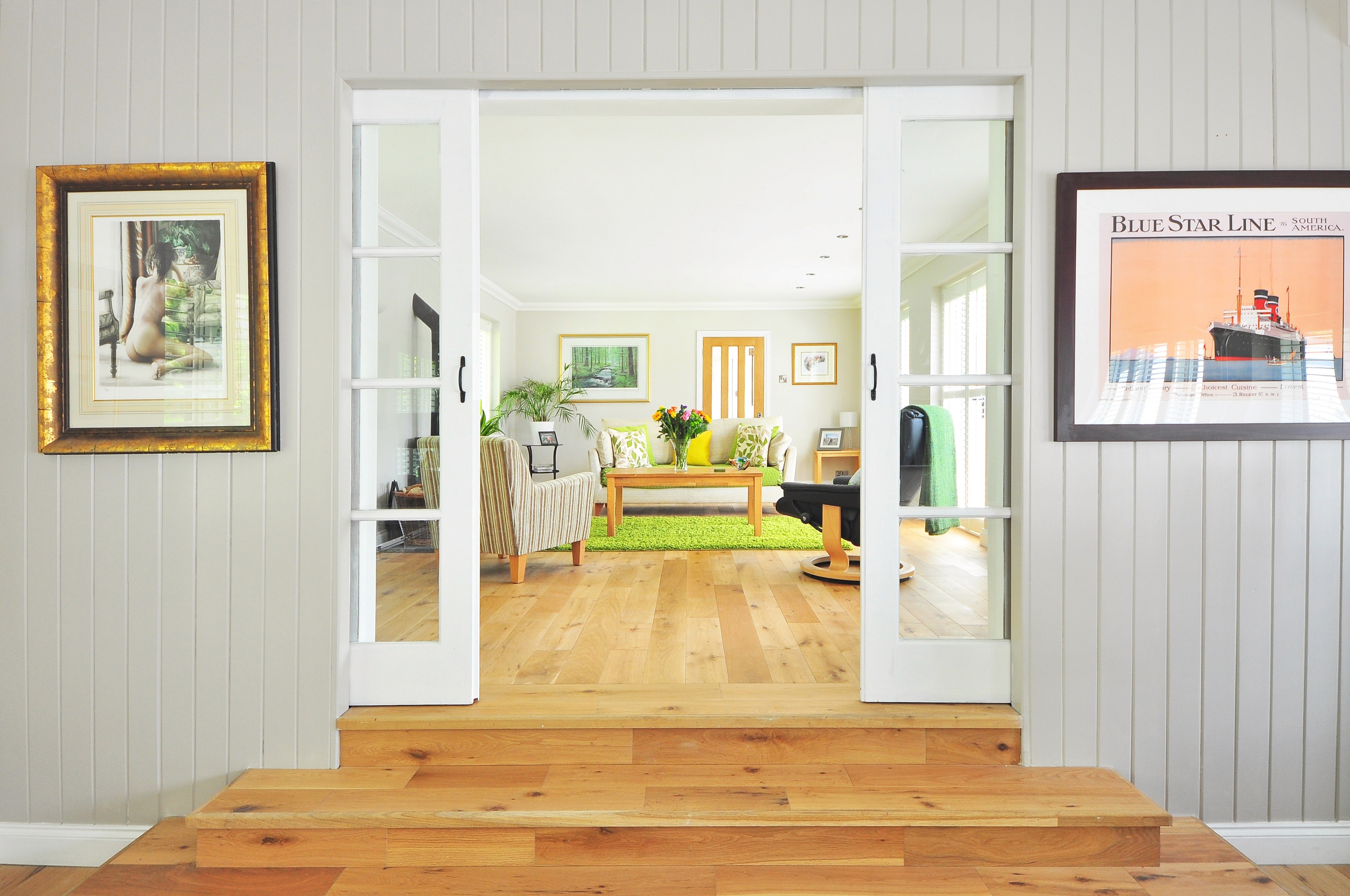
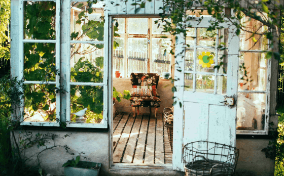
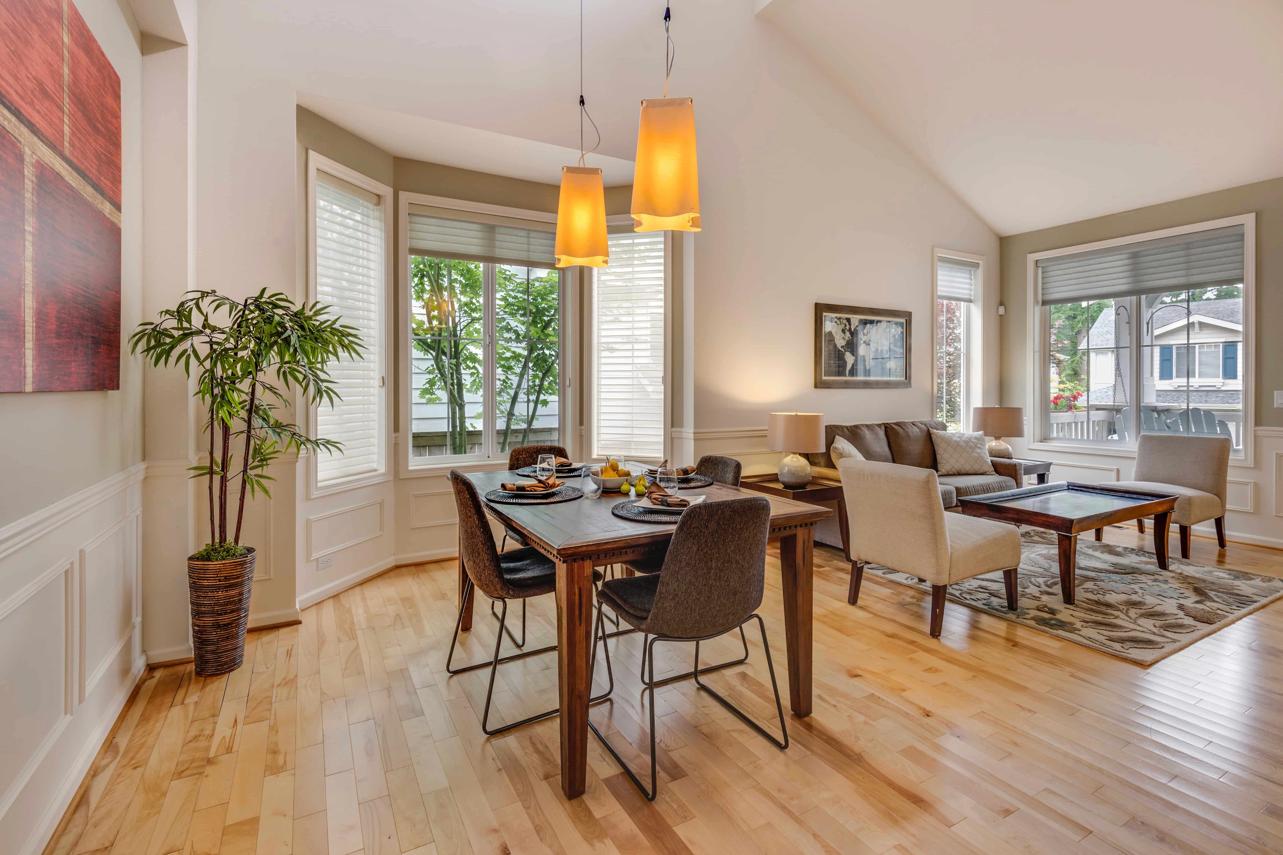

“Quick transparent
insights into a home feeling”
Fast
Clean
Welcoming


User flow
With the created visual direction, we needed to create the flow that the user will go through.
Starting point
Homepage
Search Results
Profile
Contact Advertiser
Filters
Options to save properties and searches
Settings
Log in
Register
My saved searches
Inbox
My saved properties
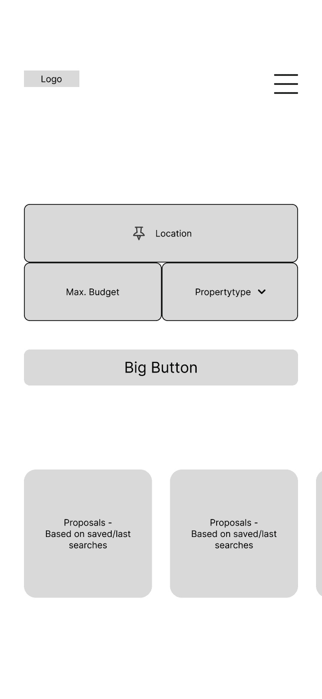
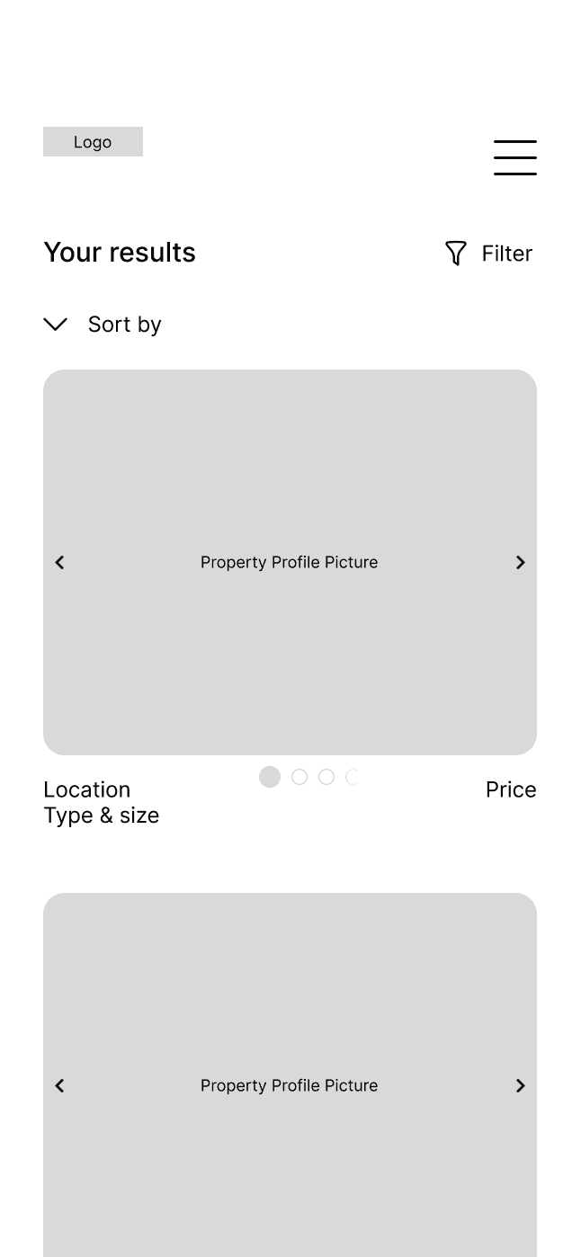
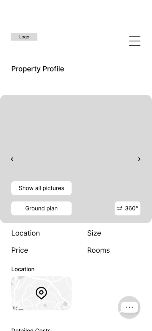
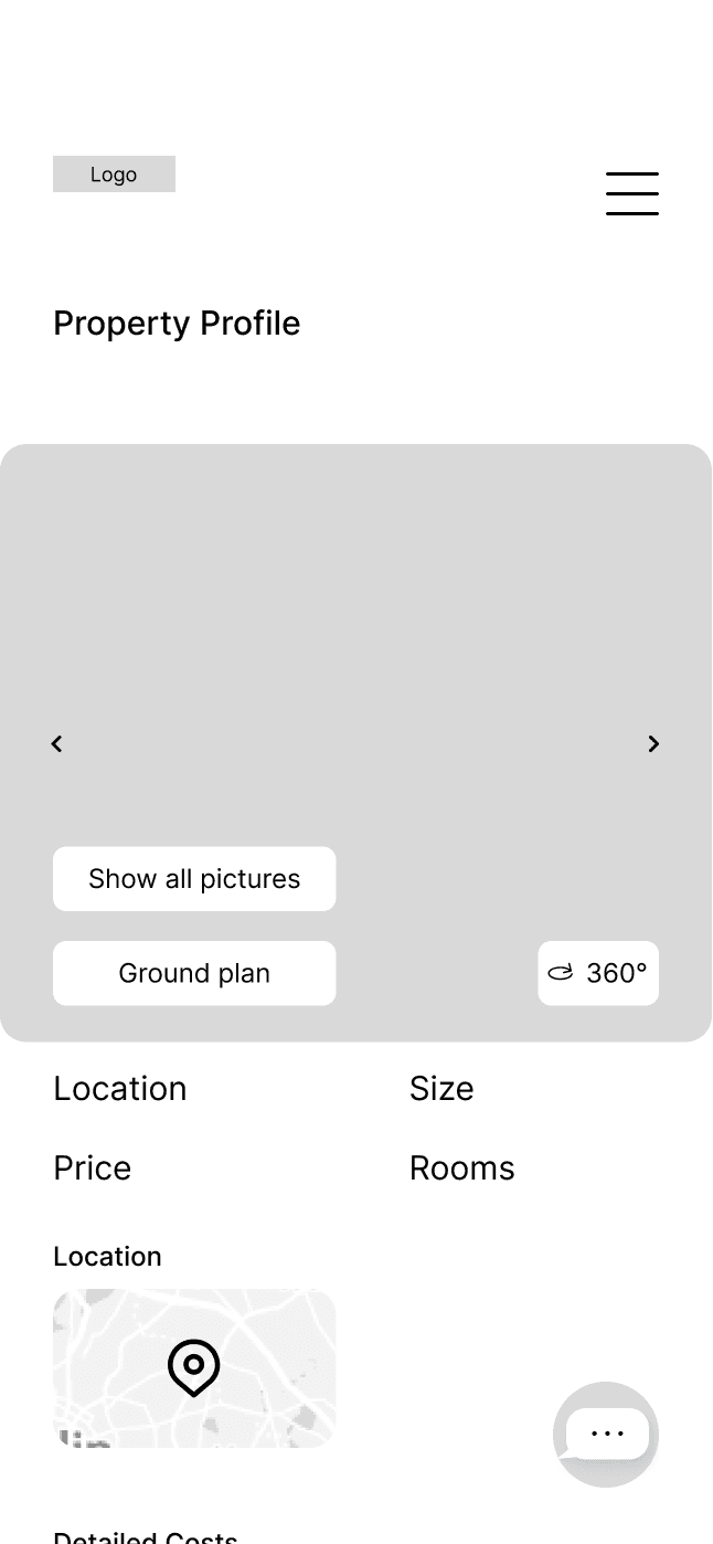
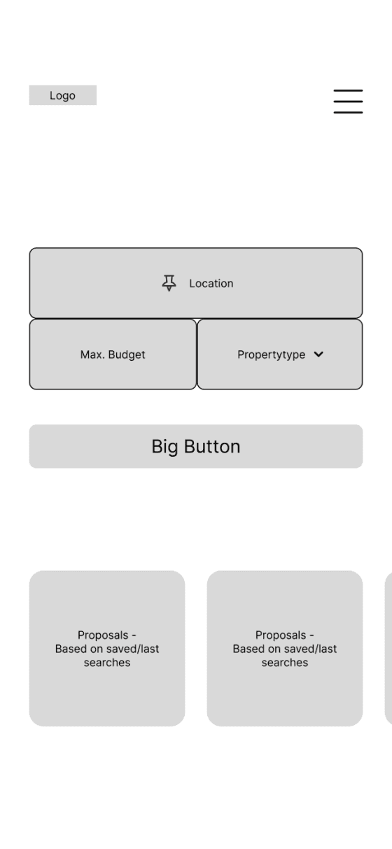
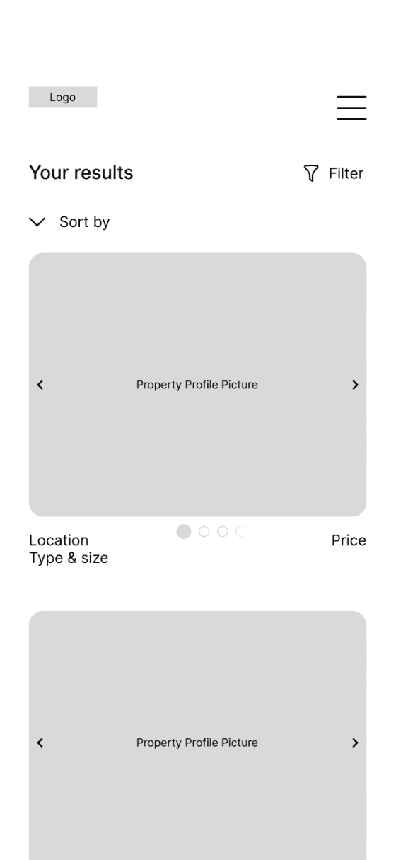
first Mobile Wireframes
Our user flow built the foundation for the first wireframes, an important progress on that we would build the next steps.
Homepage Version 1
Search Result Version 1
Property Profile Version 1



03 Adding Detail
In search of an appropriate Typography system, we tried to combine the clean modern look that we wanted to create with our web app, with the longevity that comes with the purchase of a property.
Rufina fitted perfect with its modern durable look, as Oxygen was the perfect complement.
Bold, 25/32 px
Headline 2
Bold, 31/40 px
Headline 1
Light, 20/28px
Big Body
Bold, 20/28px, 1.5% Letter Spacing
Headline 3
Bold, 17/20px, 4px Paragraph Spacing
Headline 4
Bold, 16/20px
Bold
Light, 16/20px
Body copy
Light, 12/16px
Small copy
Bold, 12/16px
Label
Rufina
Oxygen
Example
Lorem ipsum dolor sit amet, consetetur sadipscing elitr, sed diam nonumy eirmod tempor invidunt ut labore et dolore magna aliquyam erat, sed diam voluptua. At vero eos et accusam et justo duo dolores et ea rebum. Stet clita kasd gubergren, no sea takimata sanctus est Lorem ipsum dolor sit amet. Lorem ipsum dolor sit
Emphasis
Hyperlink
Bold, 16/20px
Typography
Typography
COLOR SCHEME
Hex: #F8A429
RGB (248,164,41)
Hex: #F8B859
RGB (248,184,89)
Hex: #FCD90D
RGB (252,217,13)
Background Gradient
Primary
Secondary
Primary soft
Compromised
Color Scheme
Hex: #FFFFFF
RGB (255,255,255)
89%
Hex: #FFFFFF
RGB (255,255,255)
Hex: #EBD27F
RGB (235,210,127)
100%
100%
With our analogous color scheme we wanted create a visual pleasing screen, while we chose that orange to convey a welcoming feeling.
With a soft background gradient and a lot of white space, we also wanted to make sure to outline a clean look that still has this welcoming touch.
The full color scheme containing all tones and gradients and can be viewed in the
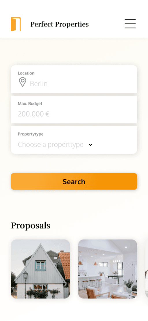
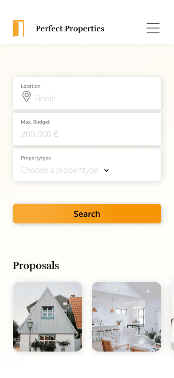
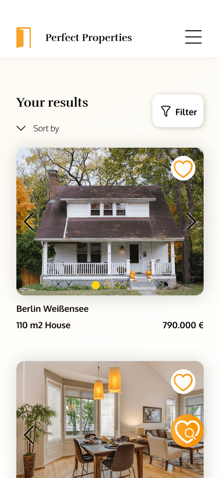
Improve UI Fidelity
Personalized suggestions as a prospect for search results
Continuous vertical input
Soft background gradient for a welcoming feel
Sticky button to save the search
Pagination integrated in the Picture Preview, with left and right floating out transpareny
White background and shade for the filter option to support its clickability
Fixed contact button to make the get in touch option always accessible
White backgrounds for the options to change screens or jumping to the ground plan
Arrows with a white shade to make them visible on different backgrounds





Before
Before
Before
After
After
After
Adding animation
Little animations were adding some smoothness and supporting our welcoming message
Swinging door - entry animation
Like property & like search

Entire Prototype
Mobile Prototype

Click screen to discover
04 Establish a culture
Design for different breakpoints
After finishing our mobile wireframes the next step had to take place - creating valuable experiences for bigger devices. As our starting point we created grid systems for tablet & desktop screens.
After finishing our mobile wireframes the next step had to take place - creating valuable experiences for bigger devices. As our starting point we created grid systems for tablet & desktop screens.


Tablet gridsystem
Desktop gridsystem
744 px
1280 px

Mobile gridsystem
430 px
With the extra space that the bigger devices offer, we tried create extra value for the user. In the shown examples of the property profile screens we used the space to show the following four property pictures in a smaller preview size.
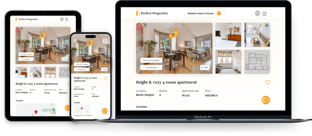

Mockups for the property profile screen
Mockups for the property profile screen
Style Guide
The goal was to create a clean design that keeps the attention of the user at the relevant, to reach their goal.
For deeper insights about the visual character, take a look the
look ahead
Perfect Properties is a project that is ready to get developed from the searching user side. The next step in the project would be the design of the process that the offering user will go through.
To bring it to life it also needs one interested business party that would evaluate a business plan and provide the needed budget. The actually product development would happen after the business interests have been clarified.
To measure the success of Perfect Properties the business side would have to track the website visits as well as the uploaded property profiles. Another interesting number to watch would be the conversion rate from website visits to property profile contact messages.
Project goal
Create a responsive web app that provides property buyers with information on properties of interest.
Project summary
Based on given user research, the goal was to create a visual concept to meet the goals of our user persona. The process to the final responsive design was started by a mood board and the created wireframes were more and more defined with a proper typography, color scheme and some animations. After translating the mobile design to bigger devices, the creation of a style guide captured the visual communication of Perfect Properties.
February 2023 - April 2023
Careerfoundry
UI Specialization
Responsive Design
Mobile-first approach
General Info
Process
Composition
Visual Design
Prototyping
Handoff
Figma
Roles
Tools
Rashida makes a good living and wants to invest in property beyond the city for increased financial security for her family.
She wants to find the right information for fast decision-making.
She wants a tool to help her find the right properties so as not to waste her time.

Rashida -
Mother & IT Consultant
About
Quotes
42years old
She / her
Toulouse, France
IT Consultant
Married with 2 children
As an IT consultant for a growing tech company, Rashida is frequently on the go, and often holds meetings by phone in her car while driving. She is good at multitasking and as she relies heavily on technology to help her with this, she is always on top of the latest trends.
I want to provide my family with financial security. I’ve been considering buying property for a while, and am looking for a tool that can help me find what I’m looking for, quickly!
“
“
Goals
01 Initial Information
PreDefined Persona
As the course was focused on the UI, an user persona was already defined.
02 Visual Direction
Using the given UX insights from our user persona Rashida, creating mood boards was the first step to find a visual direction.
Mood board
User flow
With the created visual direction, we needed to create the flow that the user will go through.
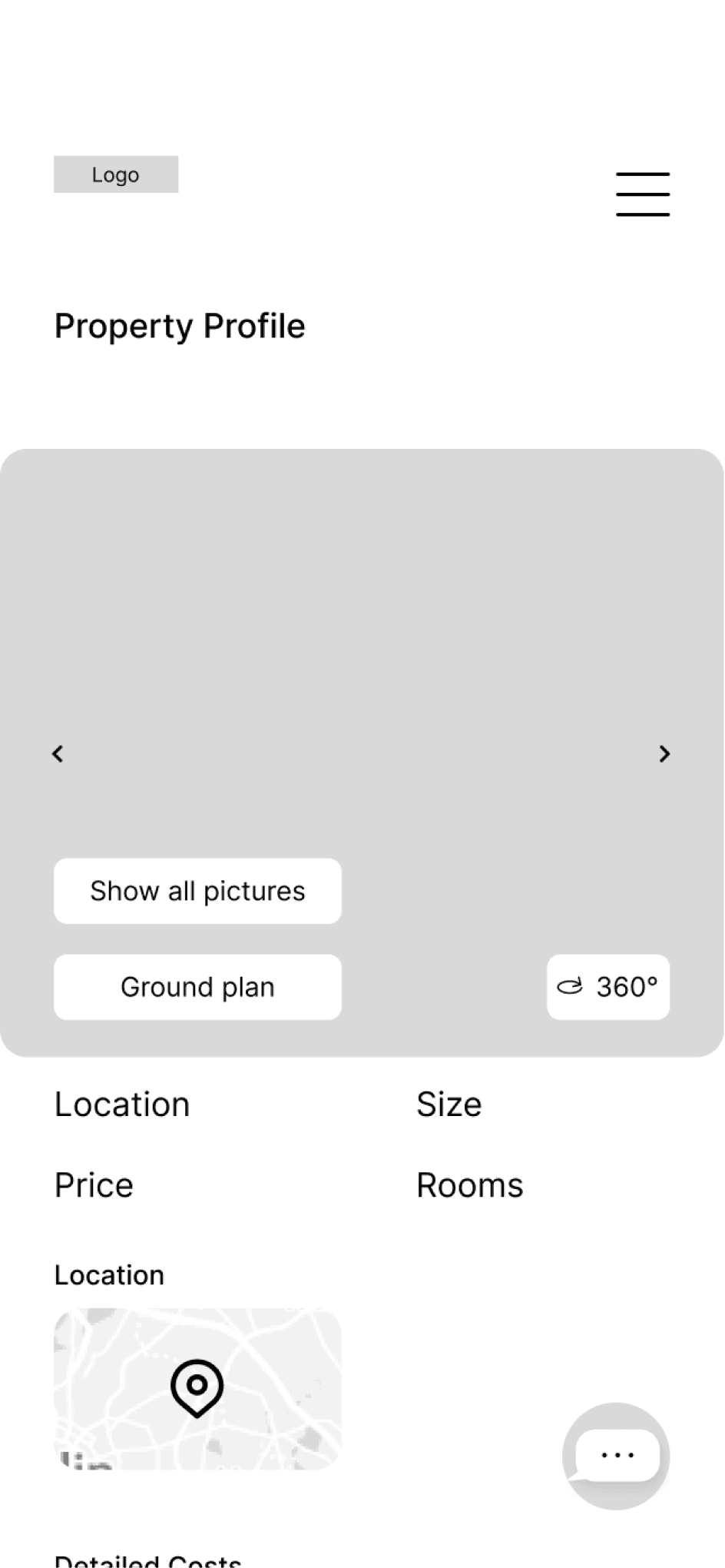
first Mobile Wireframes
Our user flow built the foundation for the first wireframes, an important progress on that we would build the next steps.
Homepage Version 1
Search Result Version 1
Property Profile Version 1


Starting point
Homepage
Search Results
Profile
Contact Advertiser
Filters
Options to save properties and searches
Settings
Log in
Register
My saved searches
Inbox
My saved properties

“Quick transparent
insights into a home feeling”
Fast
Clean
Welcoming


Typography
03 Adding Detail
In search of an appropriate Typography system, we tried to combine the clean modern look that we wanted to create with our web app, with the longevity that comes with the purchase of a property.
Rufina fitted perfect with its modern durable look, as Oxygen was the perfect complement.
Bold, 25/32 px
Headline 2
Bold, 31/40 px
Headline 1
Light, 20/28px
Big Body
Bold, 20/28px, 1.5% Spacing
Headline 3
Bold, 17/20px, 4 Paragraph Spacing
Headline 4
Bold, 16/20px
Bold
Light, 16/20px
Body copy
Light, 12/16px
Small copy
Bold, 12/16px
Label
Rufina
Oxygen
Example
Lorem ipsum dolor sit amet, consetetur sadipscing elitr, sed diam nonumy eirmod tempor invidunt ut labore et dolore magna aliquyam erat, sed diam voluptua. At vero eos et accusam et justo duo dolores et ea rebum. Stet clita kasd gubergren, no sea takimata sanctus est
Emphasis
Hyperlink
Bold, 16/20px
Typography
COLOR SCHEME
With our analogous color scheme we wanted create a visual pleasing screen, while we chose that orange to convey a welcoming feeling.
With a soft background gradient and a lot of white space, we also wanted to make sure to outline a clean look that still has this welcoming touch.
The full color scheme containing all tones and gradients and can be viewed in the Perfect Properties Style Guide.
Hex: #F8A429
RGB (248,164,41)
Hex: #F8B859
RGB (248,184,89)
Hex: #FCD90D
RGB (252,217,13)
Background Gradient
Primary
Secondary
Primary soft
Compromised Color Scheme
Hex: #FFFFFF
RGB (255,255,255)
89%
Hex: #FFFFFF
RGB (255,255,255)
Hex: #EBD27F
RGB (235,210,127)
100%
Improve UI Fidelity
After
Before
After
Before
After
Before
Personalized suggestions as a prospect for search results
Continuous vertical input
Soft background gradient for a welcoming feel
Sticky button to save the search
Pagination integrated in the Picture Preview, with left and right floating out transpareny
White background and shade for the filter option to support its clickability
Fixed contact button to make the get in touch option always accessible
White backgrounds for the options to change screens or jumping to the ground plan
Arrows with a white shade to make them visible on different backgrounds


Adding animation
Little animations were adding some smoothness and supporting our welcoming message
Swinging door - entry animation
Like property & like search
Entire Prototype
Mobile Prototype
Click screen to discover
04 Establish a culture
Design for different breakpoints
After finishing our mobile wireframes the next step had to take place - creating valuable experiences for bigger devices. As our starting point we created grid systems for tablet & desktop screens.
With the extra space that the bigger devices offer, we tried create extra value for the user. In the shown examples of the property profile screens we used the space to show the following four property pictures in a smaller preview size.
Mockups for the property profile screen


Tablet gridsystem
744 px

Desktop gridsystem
1280 px

Mobile gridsystem
430 px
Style Guide
The goal was to create a clean design that keeps the attention of the user at the relevant, to reach their goal.
For deeper insights about the visual character, take a look the
look ahead
Perfect Properties is a project that is ready to get developed from the searching user side. The next step in the project would be the design of the process that the offering user will go through.
To bring it to life it also needs one interested business party that would evaluate a business plan and provide the needed budget. The actually product development would happen after the business interests have been clarified.
To measure the success of Perfect Properties the business side would have to track the website visits as well as the uploaded property profiles. Another interesting number to watch would be the conversion rate from website visits to property profile contact messages.
Click screen to discover
Mobile Prototype
Entire Prototype
Like property & like search
Swinging door - entry animation
Little animations were adding some smoothness and supporting our welcoming message
Adding animation

February 2023 - April 2023
Careerfoundry UI Specialization
Responsive Design
Mobile-first approach
General Info
Process
Composition
Visual Design
Prototyping
Handoff
Figma
Roles
Tools
Project goal
Create a responsive web app that provides property buyers with information on properties of interest.
Project summary
Based on given user research, the goal was to create a visual concept to meet the goals of our user persona. The process to the final responsive design was started by a mood board and the created wireframes were more and more defined with a proper typography, color scheme and some animations. After translating the mobile design to bigger devices, the creation of a style guide captured the visual communication of Perfect Properties.
01 Initial Information
PreDefined Persona
As the course was focused on the UI, an user persona was already defined.
Rashida
Mother & IT Consultant
About
As an IT consultant for a growing tech company, Rashida is frequently on the go, and often holds meetings by phone in her car while driving. She is good at multitasking and as she relies heavily on technology to help her with this, she is always on top of the latest trends.
Goals
Rashida makes a good living and wants to invest in property beyond the city for increased financial security for her family.
She wants to find the right information for fast decision-making.
She wants a tool to help her find the right properties so as not to waste her time.
Quotes
I want to provide my family with financial security. I’ve been considering buying property for a while, and am looking for a tool that can help me find what I’m looking for, quickly!
“
“

42 years old
She / her
Toulouse, France
IT Consultant
Married with 2 children
02 Visual Direction
Using the given UX insights from our user persona Rashida, creating mood boards was the first step to find a visual direction.
Mood board

“Quick transparent
insights into a home feeling”
Fast
Clean
Welcoming



Starting point
Homepage
Search Results
Profile
Contact Advertiser
Filters
Options to save properties and searches
Settings
Log in
Register
My saved searches
Inbox
My saved properties
User flow
With the created visual direction, we needed to create the flow that the user will go through.
first Mobile Wireframes
Our user flow built the foundation for the first wireframes, an important progress on that we would build the next steps.
Homepage Version 1
Search Result Version 1
Property Profile Version 1


Typography
03 Adding Detail
Bold, 25/32 px
Headline 2
Bold, 31/40 px
Headline 1
Light, 20/28px
Big Body
Bold, 20/28px, 1.5% Spacing
Headline 3
Bold, 17/20px, 4 Paragraph Spacing
Headline 4
Bold, 16/20px
Bold
Light, 16/20px
Body copy
Light, 12/16px
Small copy
Bold, 12/16px
Label
Rufina
Oxygen
Example
Lorem ipsum dolor sit amet, consetetur sadipscing elitr, sed diam nonumy eirmod tempor invidunt ut labore et dolore magna aliquyam erat, sed diam voluptua. At vero eos et accusam et justo duo dolores et ea rebum. Stet clita kasd gubergren, no sea takimata sanctus est Lorem ipsum dolor sit amet. Lorem ipsum dolor sit amet
Emphasis
Hyperlink
Bold, 16/20px
Typography
In search of an appropriate Typography system, we tried to combine the clean modern look that we wanted to create with our web app, with the longevity that comes with the purchase of a property.
Rufina fitted perfect with its modern durable look, as Oxygen was the perfect complement.
COLOR SCHEME
Hex: #FFFFFF
RGB (255,255,255)
Hex: #F9F9F9
RGB (249,249,249)
Hex: #FCF8F3
RGB (252,248,243)
Hex: #D0D0D0
RGB (208,208,208)
Hex: #898989
RGB (137,137,137)
Hex: #0C0701
RGB (12,7,1)
Hex: #000000
RGB (0,0,0)
Hex: #FFFFFF
RGB (255,255,255)
Hex: #F8A429
RGB (248,164,41)
Hex: #F8B859
RGB (248,184,89)
Hex: #FCD90D
RGB (252,217,13)
Hex: #FFFFFF
RGB (255,255,255)
Hex: #EBD27F
RGB (235,210,127)
Hex: #F59506
RGB (249,169,50)
Hex: #F9A932
RGB (249,169,50)
Hex: #FCD90D
RGB (252,217,13)
100% - 0% Linear
Hex: #F8AE40
RGB (248,174,64)
Hex: #F6C376
RGB (246,195,118)
Background Gradients
From White to Black
Primary
Secondary
Primary soft
Rectangle Button Gradients
Pagination Gradient
Round Button Gradient
89%
100%
Color Scheme
With our analogous color scheme we wanted create a visual pleasing screen, while we chose that orange to convey a welcoming feeling.
With a soft background gradient and a lot of white space, we also wanted to make sure to outline a clean look that still has this welcoming touch.
Improve UI Fidelity
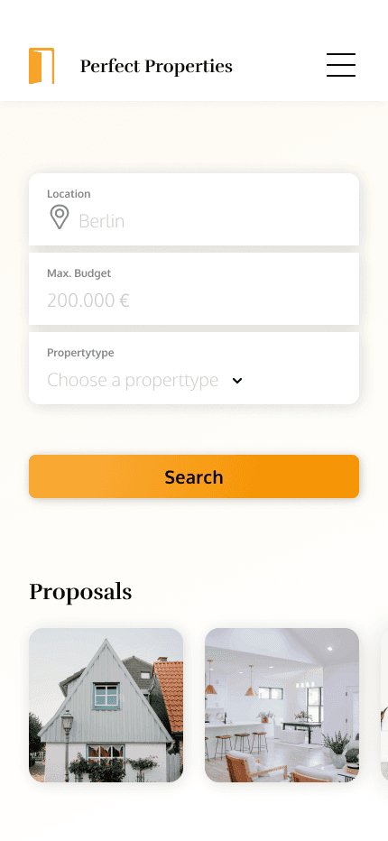
Personalized suggestions as a prospect for search results
Continuous vertical input
Soft background gradient for a welcoming feel
Sticky button to save the search
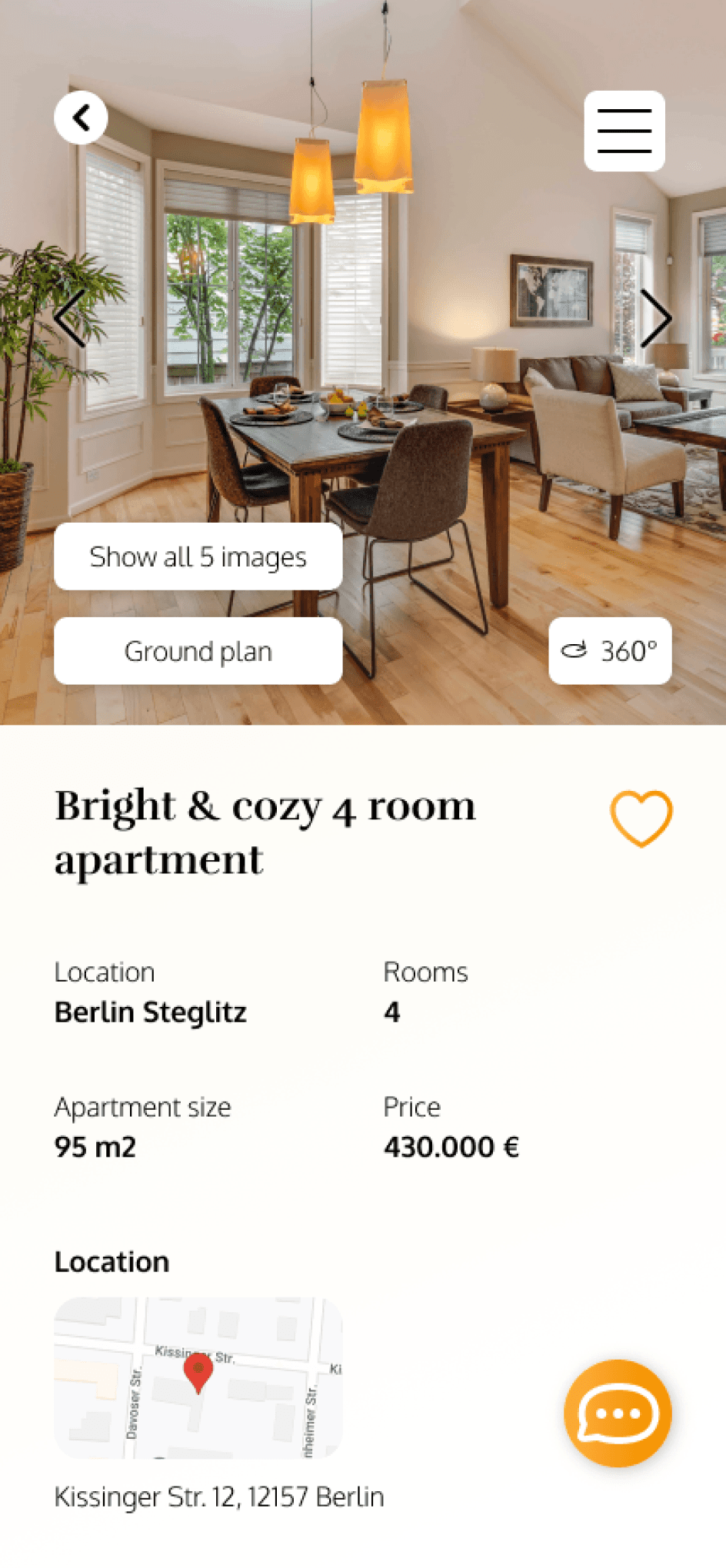
Pagination integrated in the Picture Preview, with left and right floating out transpareny
White background and shade for the filter option to support its clickability
Fixed contact button to make the get in touch option always accessible
White backgrounds for the options to change screens or jumping to the ground plan
Arrows with a white shade to make them visible on different backgrounds


Before
Before
Before
After
After
After
04 Establish a culture
Design for different breakpoints
After finishing our mobile wireframes the next step had to take place - creating valuable experiences for bigger devices. As our starting point we created grid systems for tablet & desktop screens.


Mobile gridsystem
Tablet gridsystem
Desktop gridsystem
430 px
744 px
1280 px
With the extra space that the bigger devices offer, we tried create extra value for the user. In the shown examples of the property profile screens we used the space to show the following four property pictures in a smaller preview size.
Mockups for the property profile screen

Styleguide
look ahead
Perfect Properties is a project that is ready to get developed from the searching user side. The next step in the project would be the design of the process that the offering user will go through.
To bring it to life it also needs one interested business party that would evaluate a business plan and provide the needed budget. The actually product development would happen after the business interests have been clarified.
To measure the success of Perfect Properties the business side would have to track the website visits as well as the uploaded property profiles. Another interesting number to watch would be the conversion rate from website visits to property profile contact messages.
For deeper insights about the visual character, take a look at the
