01 Identity and Concept
Without the resources to collect qualitative data from potential employees or freelance seekers, I studied the market of portfolio websites.
my design approach
Structure and elements
With the definition of the soul, the next step was to create the skeleton of my portfolio website. As I wanted to keep the focus on my skillset and projects, I decided to keep the navbar structure short and clear.
The homepage was planned to work as an overview of all content of the website and to display my skillset at its beginning.
In the first brainstorming I decided to point out my biggest strength, my skillset from all three components of digital products.
Based on my design approach, I wanted to create a calming and pleasant user experience. I decided to dive deeper into the idea of a showcasing my skillset as a gear wheel.
The inner circle of the gear wheel displays my design skills, while the outer circle showcases my skills of the other components of digital products.
The new approach had to get filled with life to create a mvp for the next user tests, as the grey sketch had too low fidelity for participants to relate to.
Based on my design approach, my portfolio website should have a conscious style. I wanted to create a portfolio, that invites the user in a kind way to stay.
The combination of the light yellow grey with the soft salmon orange builds the base of the website.
A higher contrast orange red gives an option for stronger highlights accents.
The orange black gives the option for a gentle black contrast, while the main used black has a slight yellow touch to soften the black contrast in general.
The user tests were concentrating on how easy the participants can get the informations they need.
The participants praised the visual appearance of the website. They found the informations they were told to look for in a satisfying quick and direct way.
However, they struggled to identify the skill circles as hoverable objects.
To solve that problem, an identifier was needed.
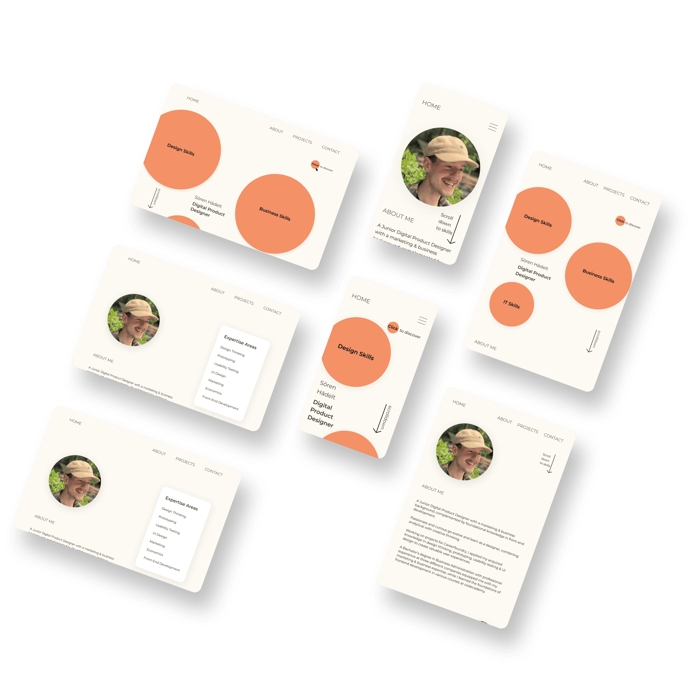
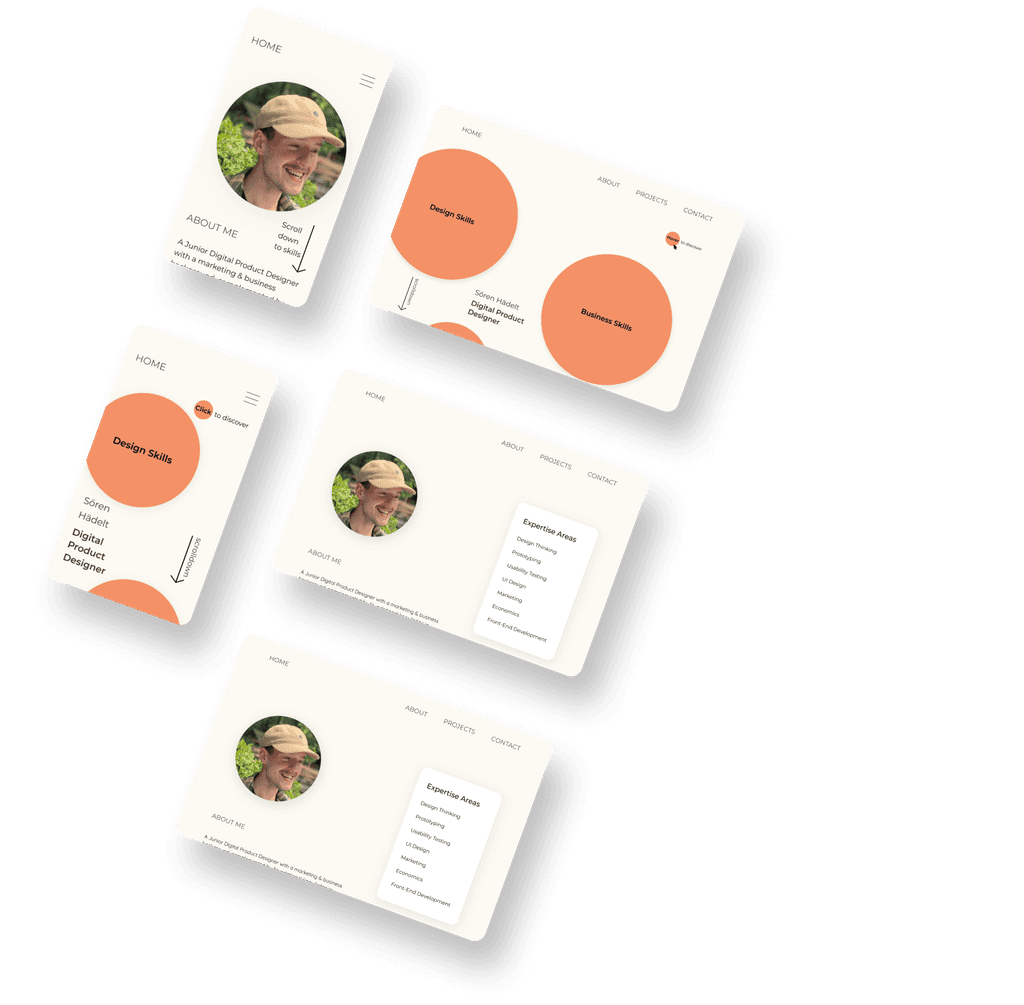
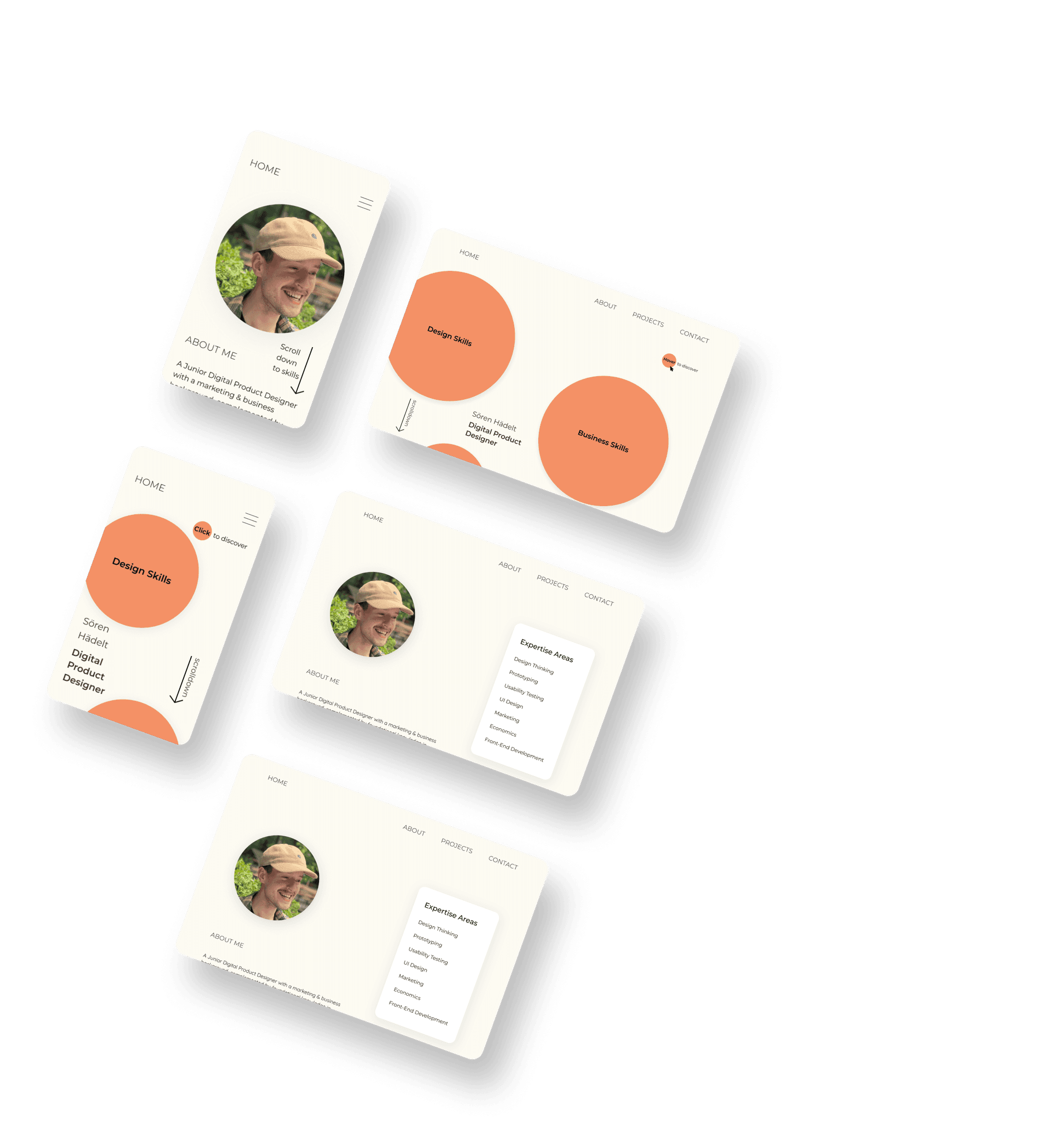
Using Framer as the no-code tool to bring the designs to life, I translated the Figma designs and put the finishing touches on them.
The search was defined for a modern soft font that aligns with the calming concept.
Using the Minor Third Type Scale, the fonts got set from the base size of the three different breakpoints.
Montserrat
Montserrat
Montserrat
In in-person user interviews with 5 participants, I wanted to get their opinions about the structure of the Homepage and the the gear wheel in its hero area. The participants shared two main insights:
The structure was clear and covered all informations they would like to get as freelance seekers.
The gear wheel was hard to read as the text is circling 360° around, and with that hard for them to quickly grasp it.
With the insights about the lack of readability, the gear wheel approach came to its end. So what’s next?
Another brainstorming led me to a hover state approach to display the set of skills in the elements of digital products.
First Wireframes
First User Tests
Colors
Typography
Apply to Concept
User Tests
Skill Circle Desktop Animation
Turnaround in the approach
As I wanted to create a brand style that matches with my design approach, I defined it by word.
It sets the fundament for the whole website, its style as well as its structure.
‘I believe that our society is on a learning curve to use digital products more consciously for their own good. I also believe that products that are designed for conscious use, will outran dark pattern driven products on the long run. As I want to create digital products that make the lives of their users better, my goal is to create products that support conscious use.’
Design
Business
Tech
Home
About Me
Projects
Contact
Business Skills
It Skills
Design Skills
My business skills Lorem ipsum dolor sit amet, consetetur sadipscing elitr, sed diam.
My IT skills Lorem ipsum dolor sit amet
My design skills Lorem ipsum dolor sit amet, consetetur sadipscing elitr, sed diam.
...with explanatory hover states
02 Visual Personality
03 Bring it to life with Framer
Highlights
Background
Blacks
HEX: #F49166
HEX: #FF5724
HEX: #FCFAF2
HEX: #432E26
HEX: #0D0D0C
Hover to discover
Project goal
Create a portfolio website that showcases my skillset and a brand design for me as a designer that suits me and my design approach.
Project summary
Starting from scratch, the goal was to create an own brand identity for me as a digital product designer. The target group was clear, potential employers and freelance seekers. Trying different approaches and doing various user tests led to the finished responsive webpage, using Figma for creation and Framer for development.
June 2023 - September 2023
Potential employers
Freelance seeker
Time Period
Target Group
Research
Conceptualization
Usability Testing
End-to-End Design
Figma
Framer
Roles
Tools
soerenhaedelt.com
Designer
Portfolio
Website
Evaluation of the whole design process from conception through wireframing to prototyping and usability testing. Always based on a user-centered design thinking process.
Design Skills
Understanding of business and markets meets marketing expertise with experience in B2B and B2C. The ability to see behind the product and identify its capabilities and constraints.
Business Skills
Front-end development basics for an understanding in the development process.
IT Skills
Digital Product Designer
Sören Hädelt
June 2023 - September 2023
Potential employers
Freelance seekers
General Info
Target Group
Research
Conceptualization
Usability Testing
End-to-End Design
Figma
Framer
Roles
Tools
Project summary
Starting from scratch, the goal was to create an own brand identity for me as a digital product designer. The target group was clear, potential employers and freelance seekers. Trying different approaches and doing various user tests led to the finished responsive webpage, using Figma for creation and Framer for development.
Project goal
Create a portfolio website that showcases my skillset and a brand design for me as a designer that suits me and my design approach.
01 Identity and Concept
Without the resources to collect qualitative data from potential employees or freelance seekers, I studied the market of portfolio websites.
my design approach
As I wanted to create a brand style that matches with my design approach, I defined it by word.
It sets the fundament for the whole website, its style as well as its structure.
‘I believe that our society is on a learning curve to use digital products more consciously for their own good. I also believe that products that are designed for conscious use, will outran dark pattern driven products on the long run. As I want to create digital products that make the lives of their users better, my goal is to create products that support conscious use.’
‘I believe that our society is on a learning curve to use digital products more consciously for their own good. I also believe that products that are designed for conscious use, will outran dark pattern driven products on the long run. As I want to create digital products that make the lives of their users better, my goal is to create products that support conscious use.’
Structure and elements
Home
About Me
Projects
Contact
With the definition of the soul, the next step was to create the skeleton of my portfolio website. As I wanted to keep the focus on my skillset and projects, I decided to keep the navbar structure short and clear.
The homepage was planned to work as an overview of all content of the website and to display my skillset at its beginning.
First Wireframes
In the first brainstorming I decided to point out my biggest strength, my skillset from all three components of digital products.
Design
Business
Tech
Based on my design approach, I wanted to create a calming and pleasant user experience. I decided to dive deeper into the idea of a showcasing my skillset as a gear wheel.
The inner circle of the gear wheel displays my design skills, while the outer circle showcases my skills of the other components of digital products.
First User Tests
In in-person user interviews with 5 participants, I wanted to get their opinions about the structure of the Homepage and the the gear wheel in its hero area. The participants shared two main insights:
The structure was clear and covered all informations they would like to get as freelance seekers.
The gear wheel was hard to read as the text is circling 360° around, and with that hard for them to quickly grasp it.
Turnaround
in the approach
With the insights about the lack of readability, the gear wheel approach came to its end. So what’s next?
Another brainstorming led me to a hover state approach to display the set of skills in the elements of digital products.
...with explanatory hover states
Business Skills
It Skills
Design Skills
My business skills Lorem ipsum dolor sit
My IT Skills Lorem ipsum
My design skills Lorem ipsum dolor sit
02 Visual personality
The new approach had to get filled with life to create a mvp for the next user tests, as the grey sketch had too low fidelity for participants to relate to.
Based on my design approach, my portfolio website should have a conscious style. I wanted to create a portfolio, that invites the user in a kind way to stay.
Highlights
Background
Blacks
HEX: #F49166
HEX: #FF5724
HEX: #FCFAF2
HEX: #432E26
HEX: #0D0D0C
Colors
The combination of the light yellow grey with the soft salmon orange builds the base of the website.
A higher contrast orange red gives an option for stronger highlights accents.
The orange black gives the option for a gentle black contrast, while the main used black has a slight yellow touch to soften the black contrast in general.
The search was defined for a modern soft font that aligns with the calming concept.
Using the Minor Third Type Scale, the fonts got set from the base size of the three different breakpoints.
Montserrat
Montserrat
Montserrat
Typography
Apply to Concept
User Tests
The user tests were concentrating on how easy the participants can get the informations they need.
The participants praised the visual appearance of the website. They found the informations they were told to look for in a satisfying quick and direct way.
However, they struggled to identify the skill circles as hoverable objects.
To solve that problem, an identifier was needed.
Click circles to discover
Using Framer as the no-code tool to bring the designs to life, I translated the Figma designs and put the finishing touches on them.
Skill Circle Desktop Animations
03 Bring it to life
with Framer
Design Skills
IT Skills
Business Skills
Digital Product Designer
Sören Hädelt
Project summary
Starting from scratch, the goal was to create an own brand identity for me as a digital product designer. The target group was clear, potential employers and freelance seekers. Trying different approaches and doing various user tests led to the finished responsive webpage, using Figma for creation and Framer for development.
June 23 - September 23
Potential employers
Freelance seekers
General Info
Target Group
Research
Conceptualization
Usability Testing
End-to-End Design
Figma
Framer
Roles
Tools
Project goal
Create a portfolio website that showcases my skillset and a brand design for me as a designer that suits me and my design approach.
01 Identity and Concept
Without the resources to collect qualitative data from potential employees or freelance seekers, I studied the market of
portfolio websites.
my design approach
Structure and elements
With the definition of the soul, the next step was to create the skeleton of my portfolio website. As I wanted to keep the focus on my skillset and projects, I decided to keep the navbar structure short and clear.
As I wanted to create a brand style that matches with my design approach, I defined it by word.
It sets the fundament for the whole website, its style as well as its structure.
‘I believe that our society is on a learning curve to use digital products more consciously for their own good. I also believe that products that are designed for conscious use, will outran dark pattern driven products on the long run. As I want to create digital products that make the lives of their users better, my goal is to create products that support conscious use.’
Home
About Me
Projects
Contact
The homepage was planned to work as an overview of all content of the website and to display my skillset at its beginning.
First Wireframes
In the first brainstorming I decided to point out my biggest strength, my skillset from all three components of digital products.
Design
Business
Tech
Based on my design approach, I wanted to create a calming and pleasant user experience. I decided to dive deeper into the idea of a showcasing my skillset as a gear wheel.
The inner circle of the gear wheel displays my design skills, while the outer circle showcases my skills of the other components of digital products.
In in-person user interviews with 5 participants, I wanted to get their opinions about the structure of the Homepage and the the gear wheel in its hero area. The participants shared two
main insights:
The structure was clear and covered all informations they would like to get as freelance seekers.
The gear wheel was hard to read as the text is circling 360° around, and with that hard for them to quickly grasp it.
With the insights about the lack of readability, the gear wheel approach came to its end. So what’s next?
Another brainstorming led me to a hover state approach to display the set of skills in the elements of digital products.
First User Tests
Turnaround in the approach
Business Skills
It Skills
Design Skills
My business skills Lorem ipsum dolor sit amet, consetetur sadipscing elitr, sed diam.
My IT skills Lorem ipsum dolor sit amet,
My design skills Lorem ipsum dolor sit amet, consetetur sadipscing elitr, sed diam.
...with explanatory hover states
The new approach had to get filled with life to create a mvp for the next user tests, as the grey sketch had too low fidelity for participants to relate to.
Based on my design approach, my portfolio website should have a conscious style. I wanted to create a portfolio, that invites the user in a kind way to stay.
Colors
02 Visual Identity
Highlights
Background
Blacks
HEX: #F49166
HEX: #FF5724
HEX: #FCFAF2
HEX: #432E26
HEX: #0D0D0C
The combination of the light yellow grey with the soft salmon orange builds the base of the website.
A higher contrast orange red gives an option for stronger highlights accents.
The orange black gives the option for a gentle black contrast, while the main used black has a slight yellow touch to soften the black contrast in general.
The search was defined for a modern soft font that aligns with the calming concept.
Using the Minor Third Type Scale, the fonts got set from the base size of the three different breakpoints.
Montserrat
Montserrat
Montserrat
Typography
Apply to Concept
Design Skills
Business Skills
IT Skills
Digital Product Designer
Sören Hädelt
The user tests were concentrating on how easy the participants can get the informations they need.
The participants praised the visual appearance of the website. They found the informations they were told to look for in a satisfying quick and direct way.
However, they struggled to identify the skill circles as hoverable objects.
To solve that problem, an identifier was needed.
User Tests
Click circles to discover
Using Framer as the no-code tool to bring the designs to life, I translated the Figma designs and put the finishing touches on them.
Skill Circle Desktop Animations
03 Bring it to life with Framer


