Change of user journey to get assistance from a professional
The turnaround
With the goal in mind to keep the app interaction as easy and fast as possible, the expert selection & with that the search bar, category section & profiles got cut out. Instead there was placed a chat bot that connects the user to an live available professional or open up a case for the user if there is no suitable pro available.
The registration process was positioned as late as possible to lower the barrier to interact with Prossistance.
Log In
New User?
Chat Bot
Onboarding
Video Call
Problem solved?
Automatic payment
Expert Chat
Open Up Case
Chatbot Interaction
Registration
Support Chat
Review
Add
Payment Details
Funnel the user journey - change of the screens
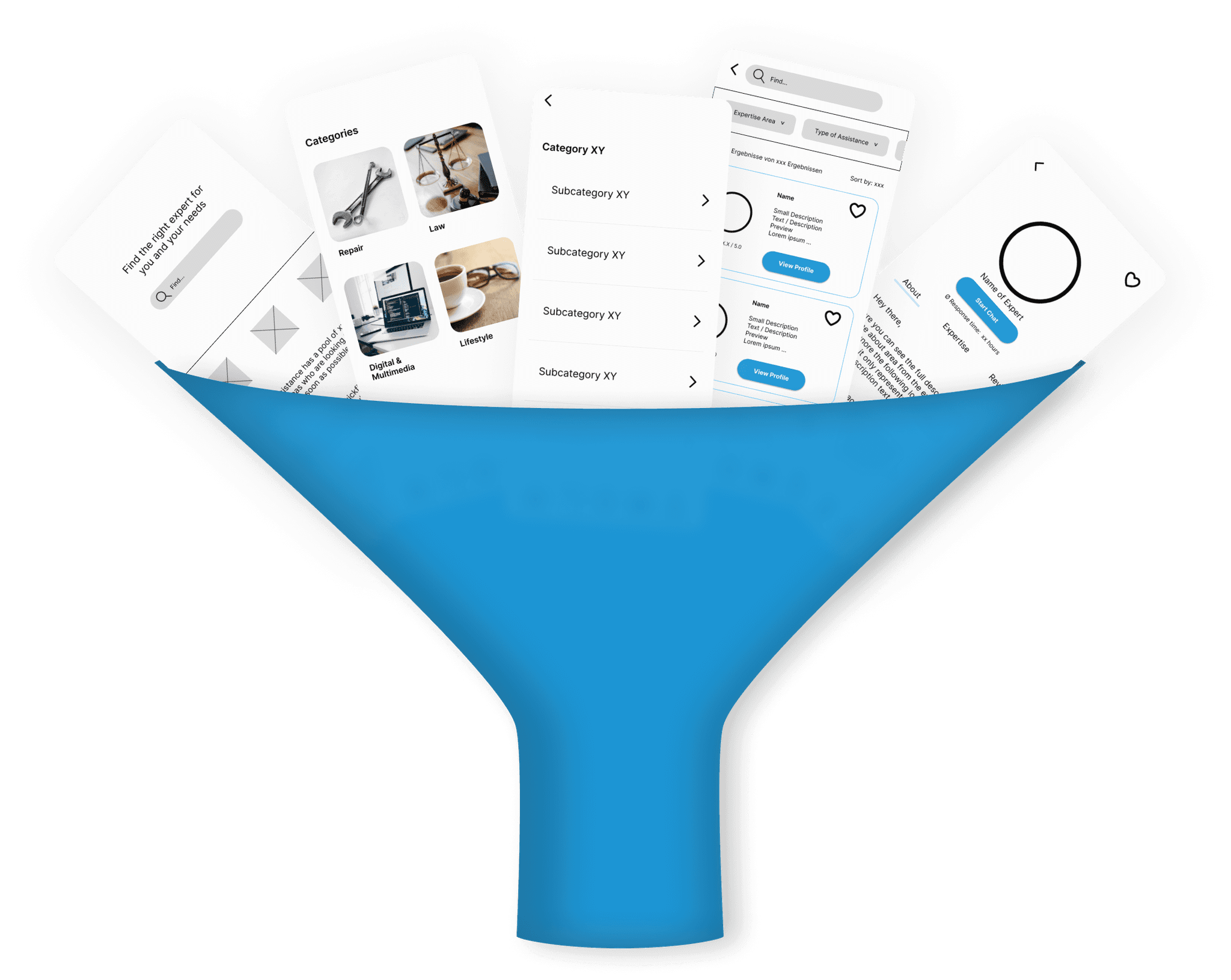
The new user journey leads to new screens. As the user goes now on a new streamlined journey to chat to a professional, we also have to streamline the screens.
Usability Test 1.0 Screens
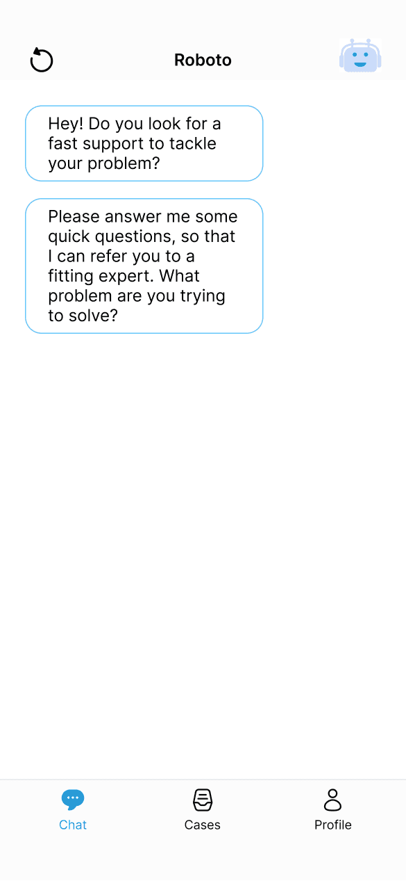

Usability Test 2.0 Screens
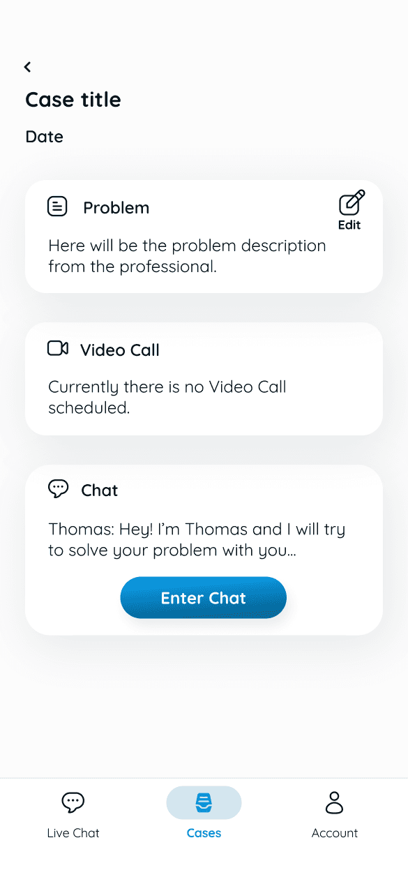
New feature - open up a case
Second User Testing
With the new screens & the new user journey, there were 3 more usability tests conducted.
You can take a look at the script here.
The participants felt way better supported throughout the process. The numbers back these observations.
So the second usability test session showed the increase of the value for the user with through the new structure.
After the turnaround there was only the option for a live chat. That created the need to offer help for any case and try to solve it.
As a consequence there was implemented the option to open up a case as another option next to the livechat. Both option lead to the possibility to book a video call with the professional in charge.
These new feature gives the user a more comprehensive help and time flexibility.
Advantages of the new user journey
+ Faster experience
+ Lower barriers
+ Less decision making
+ More time flexibility for the user
+ More guidance & support through the process
+ Better use of pool of professionals, as Prossistance can allocate them with more knowledge than user
Time to get in contact with an expert ...
Satisfaction about ...
... the easiness of connecting with pro
... the time it took to connect with a pro
01:49 min
04:28 min
1st User Test
2nd User Test
81%
95%
74%
95%
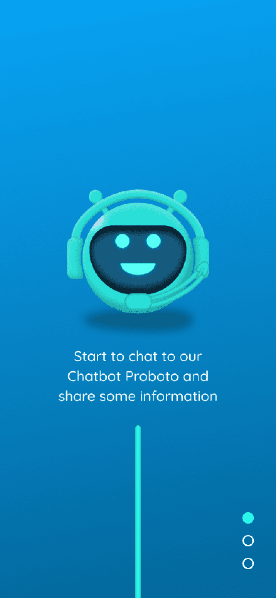
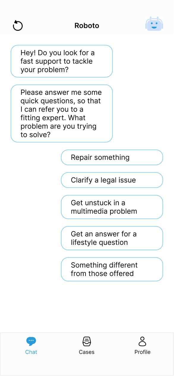
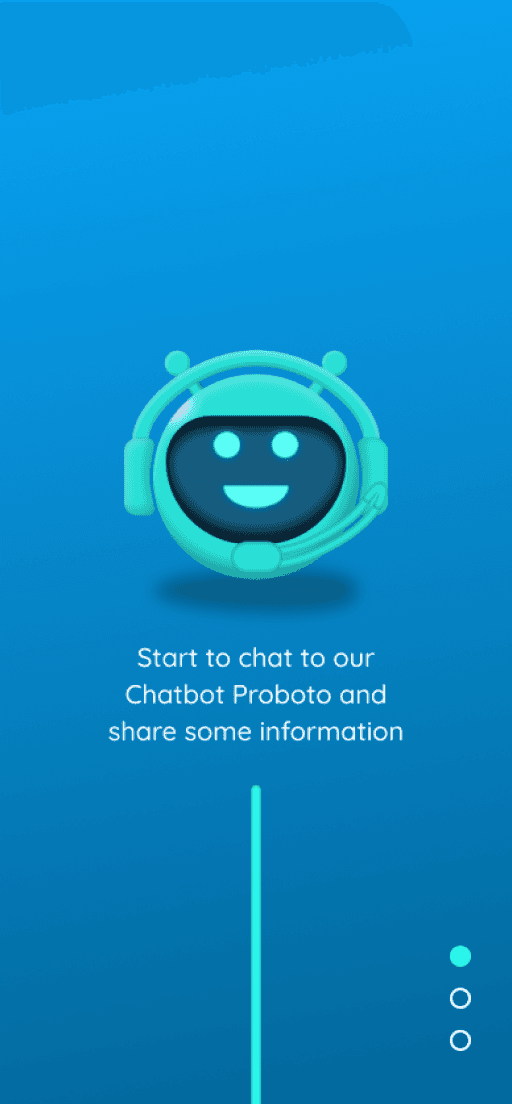
A progress indicator to the vertical scroll that fills out when sliding down, visualizes the flow for the user & gives a feeling of fast progress.
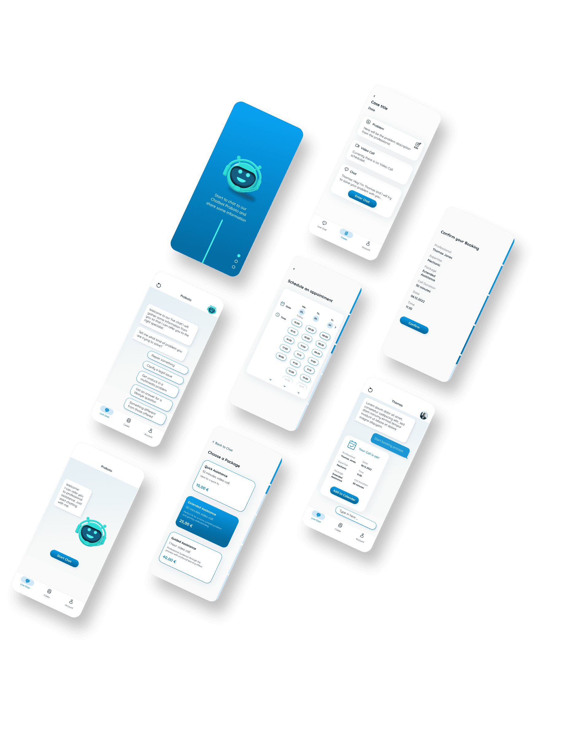
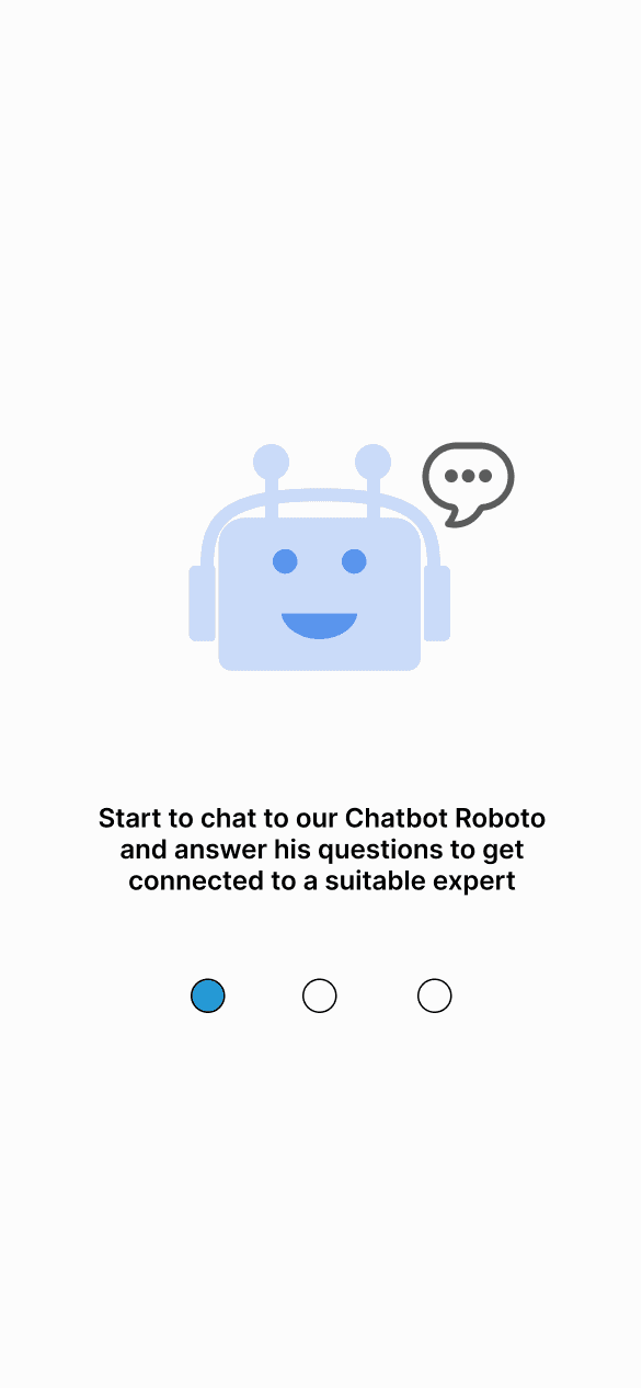
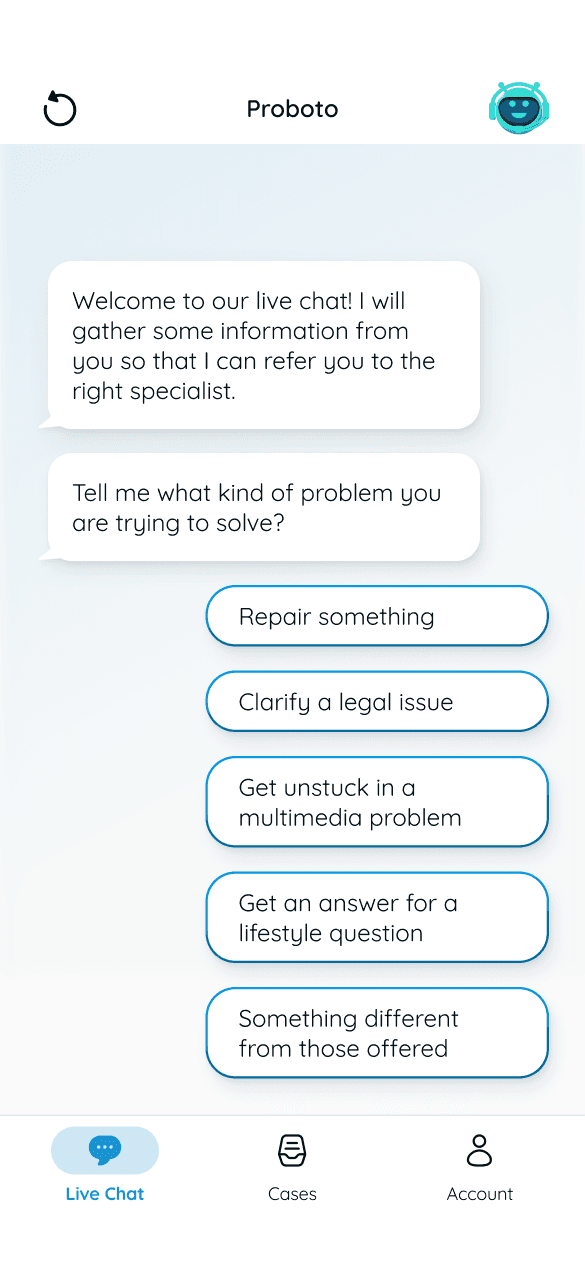
More personality for the chatbot Proboto with an improved UI. The round form gives it more character of being a full robot instead of a flying head.
Background gradient for the eye and a higher branding effect.
Navbar Indicator for higher accessibility
Differentiation between sent messages in bubbles and answer options to choose of with borderer buttons
Soft background color for a good feeling
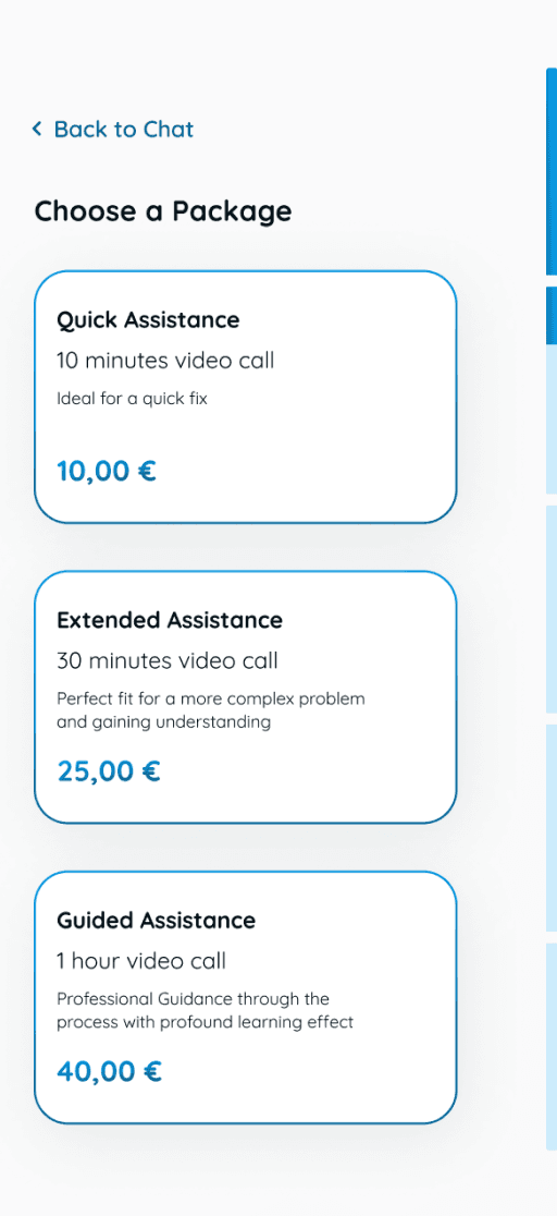
Progress Indicator that shows where the user is in the booking process and how many steps are ahead.
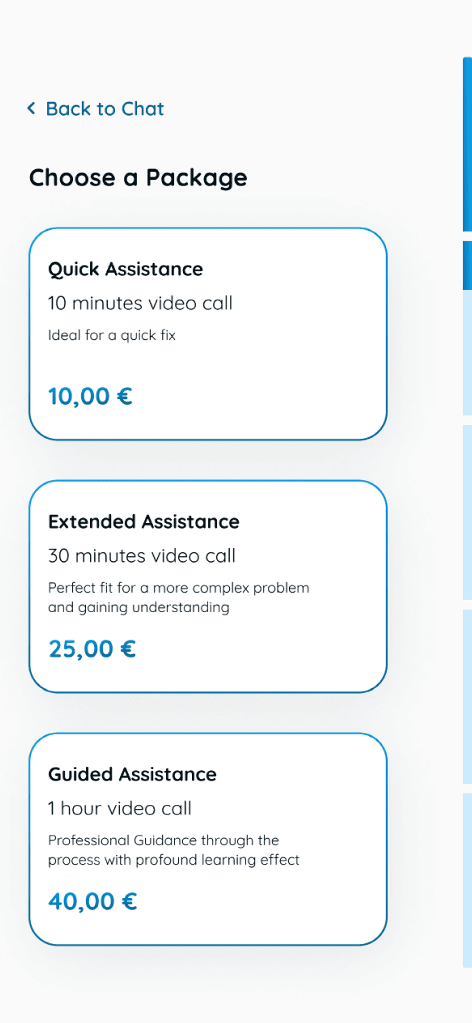
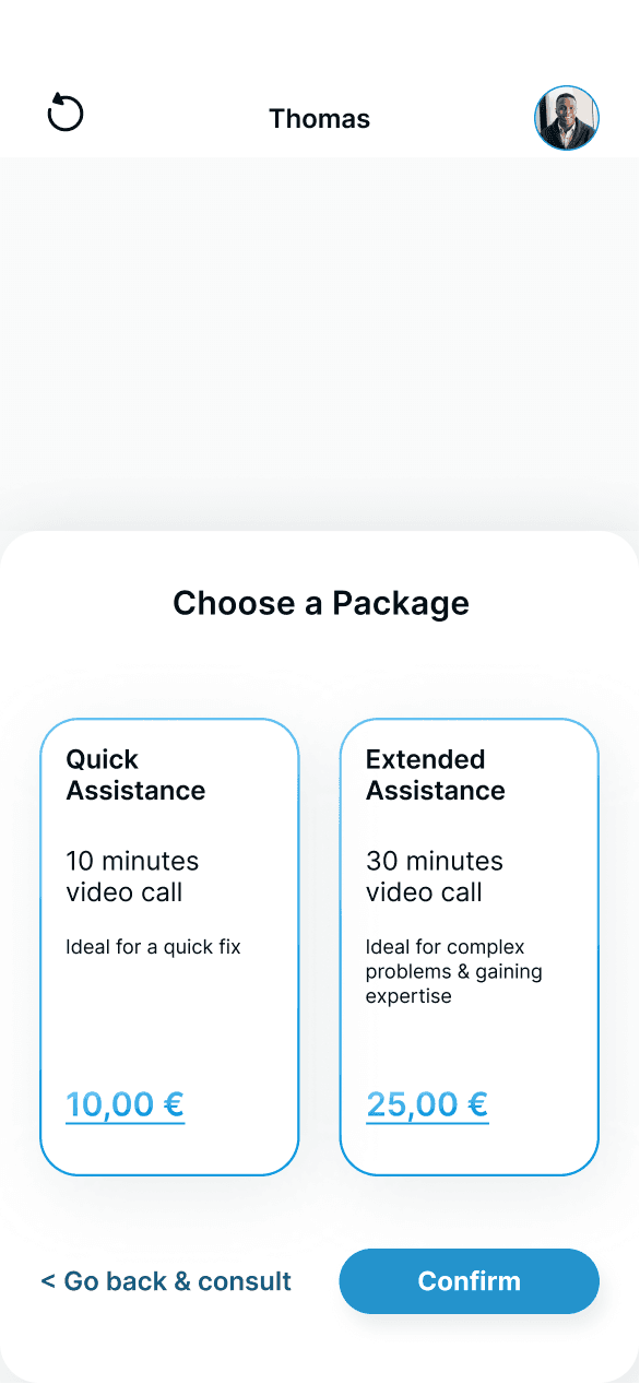
A third package as the user tends to choose the middle one within three options, while with two options to the cheaper one.
No Confirm button, instead a fillout of the choosed package & an automatic scroll down.
After
After
After
Before
Before
Before
In the conversation with the expert, the user gets the chance to schedule a video call. The user gets supported throughout this process by a progress bar that is indicating how many steps are made and how many are ahead.
Schedule a call
The quick chatbot interaction gives the user the opportunity to describe his problem while the chatbot can refer the problem to the right expert based on the categorization.
The loading bar shows the maximum time it takes for the user to get connected to an expert or back to Proboto if no suitable expert is available.
Connect to expert
Onboarding
The process shows our chatbot Proboto, that our users will also have their first interaction with at the first screen after the onboarding.
In a vertical flow is the journey for the user visualized with the created value presented at the end.
Bring it to life
Microinteractions, created with Protopie, show the features & flow of Prossistance in the following.
03 Interface design & Features
Improve Fidelity & usability
Design Language System
For deeper insights about the visual character, take a look the
look ahead
The goal was to create a clean design that keeps the attention of the user at the relevant, to reach their goal.
Design language system
Prossistance is a project that is ready to get developed from the help seeking user side. The next steps would be to create a responsive webdesign and to start the research for the help offering professional users.
For a product launch there would be the need of investors to bring on board, as higher costs than return is to be expected at the start. Professionals have to be recruited and Prossistance has to be appropriately placed on the market.
A requirement to success would be the broad recruitment of professionals to set up Prossistance as the digital contact point to get fast and easy professional assistance. The number of help seeking users would be the second number to watch for the start process and with that also the conversion rate to buy the product.
04 Final Steps
Change of user journey to get assistance from a professional
The turnaround
With the goal in mind to keep the app interaction as easy and fast as possible, the expert selection & with that the search bar, category section & profiles got cut out. Instead there was placed a chat bot that connects the user to an live available professional or open up a case for the user if there is no suitable pro available.
The registration process was positioned as late as possible to lower the barrier to interact with Prossistance.
New User?
Chatbot Interaction
Automatic Payment
Problem solved?
Log In
Chatbot
Open up a case
Expert Chat
Registration
Log In
Add
Payment Details
Support Chat
Review
Video Call
Funnel the user journey - change of the screens
The new user journey leads to new screens. As the user goes now on a new streamlined journey to chat to a professional, we also have to streamline the screens.
The new user journey leads to new screens. As the user goes now on a new streamlined journey to chat to a professional, we also have to streamline the screens.
Usability Test 1.0 Screens


Usability Test 2.0 Screens
New feature -
open up a case
New feature - open up a case
After the turnaround there was only the option for a live chat. That created the need to offer help for any case and try to solve it.
As a consequence there was implemented the option to open up a case as another option next to the livechat. Both option lead to the possibility to book a video call with the professional in charge.
These new feature gives the user a more comprehensive help and time flexibility.
Advantages of the new user journey
+ Faster experience
+ Lower barriers
+ Less decision making
+ More time flexibility for the user
+ More guidance & support through the process
+ Better use of pool of professionals, as Prossistance can allocate them with more knowledge than user

Second User Testing
With the new screens & the new user journey, there were 3 more usability tests conducted.
You can take a look at the script here.
The participants felt way better supported throughout the process. The numbers back these observations.
So the second usability test session showed the increase of the value for the user with through the new structure.
Time to get in contact with an expert ...
Satisfaction about ...
... the time it took to connect with a pro
... the easiness of connecting with pro
... the easiness of connecting with pro
95%
74%
81%
95%
1st User Test
2nd User Test
01:49 min
04:28 min
In the conversation with the expert, the user gets the chance to schedule a video call. The user gets supported throughout this process by a progress bar that is indicating how many steps are made and how many are ahead.
Schedule a call

Connect to expert
The quick chatbot interaction gives the user the opportunity to describe his problem while the chatbot can refer the problem to the right expert based on the categorization.
The loading bar shows the maximum time it takes for the user to get connected to an expert or back to Proboto if no suitable expert is available.

Onboarding
The process shows our chatbot Proboto, that our users will also have their first interaction with at the first screen after the onboarding.
In a vertical flow is the journey for the user visualized with the created value presented at the end.

Bring it to life
Microinteractions, created with Protopie, show the features & flow of Prossistance in the following.
Background gradient for the eye and a higher branding effect.
A progress indicator to the vertical scroll that fills out when sliding down, visualizes the flow for the user & gives a feeling of fast progress.
More personality for the chatbot Proboto with an improved UI. The round form gives it more character of being a full robot instead of a flying head.
Soft background color for a good feeling
Differentiation between sent messages in bubbles and answer options to choose of with borderer buttons
Navbar Indicator for higher accessibility
Progress Indicator that shows where the user is in the booking process and how many steps are ahead.
A third package as the user tends to choose the middle one within three options, while with two options to the cheaper one.
03 Interface design & Features
Improve Fidelity & usability
Improve Fidelity
& usability

After
Before


After
Before

After
Before
No Confirm button, instead a fillout of the choosed package & an automatic scroll down.
Design language system
The goal was to create a clean design that keeps the attention of the user at the relevant, to reach their goal.
04 Final Steps
For deeper insights about the visual character, take a look the
Prossistance is a project that is ready to get developed from the help seeking user side. The next steps would be to create a responsive webdesign and to start the research for the help offering professional users.
For a product launch there would be the need of investors to bring on board, as higher costs than return is to be expected at the start. Professionals have to be recruited and Prossistance has to be appropriately placed on the market.
A requirement to success would be the broad recruitment of professionals to set up Prossistance as the digital contact point to get fast and easy professional assistance. The number of help seeking users would be the second number to watch for the start process and with that also the conversion rate to buy the product.
look ahead
Page 2 / 2
Page 2 / 2
Change of user journey to get assistance from a professional
The turnaround
New User?
Chatbot Interaction
Automatic Payment
Problem solved?
Log In
Chatbot
Open up a case
Expert Chat
Registration
Log In
Add
Payment Details
Support Chat
Review
Video Call
Funnel the user journey - change of the screens
The new user journey leads to new screens. As the user goes now on a new streamlined journey to chat to a professional, we also have to streamline the screens.
Usability Test 1.0 Screens
Usability Test 2.0 Screens
Time to get in contact with an expert ...
Satisfaction about ...
... the easiness of connecting with pro
... the time it took to connect with a pro
01:49 min
04:28 min
1st User Test
2nd User Test
74%
95%
81%
95%
Second User Testing
With the new screens & the new user journey, there were 3 more usability tests conducted.
You can take a look at the script here.
The participants felt way better supported throughout the process. The numbers back these observations.
So the second usability test session showed the increase of the value for the user with through the new structure.
New feature - open up a case
After the turnaround there was only the option for a live chat. That created the need to offer help for any case and try to solve it.
As a consequence there was implemented the option to open up a case as another option next to the livechat. Both option lead to the possibility to book a video call with the professional in charge.
These new feature gives the user a more comprehensive help and time flexibility.

Advantages of the new user journey
+ Faster experience
+ Lower barriers
+ Less decision making
+ More time flexibility for the user
+ More guidance & support through the process
+ Better use of pool of professionals, as Prossistance can allocate them with more knowledge than user


Bring it to life
In the conversation with the expert, the user gets the chance to schedule a video call. The user gets supported throughout this process by a progress bar that is indicating how many steps are made and how many are ahead.
Schedule a call
The quick chatbot interaction gives the user the opportunity to describe his problem while the chatbot can refer the problem to the right expert based on the categorization.
The loading bar shows the maximum time it takes for the user to get connected to an expert or back to Proboto if no suitable expert is available.
Connect to expert
The process shows our chatbot Proboto, that our users will also have their first interaction with at the first screen after the onboarding.
In a vertical flow is the journey for the user visualized with the created value presented at the end.
Onboarding
Microinteractions, created with Protopie, show the features & flow of Prossistance in the following.
03 Interface design & Features
Improve Fidelity & usability


A progress indicator to the vertical scroll that fills out when sliding down, visualizes the flow for the user & gives a feeling of fast progress.
More personality for the chatbot Proboto with an improved UI. The round form gives it more character of being a full robot instead of a flying head.
Background gradient for the eye and a higher branding effect.
After
After
Before
Before
Navbar Indicator for higher accessibility
Differentiation between sent messages in bubbles and answer options to choose of with borderer buttons
Soft background color for a good feeling
Progress Indicator that shows where the user is in the booking process and how many steps are ahead.
A third package as the user tends to choose the middle one within three options, while with two options to the cheaper one.
No Confirm button, instead a fillout of the choosed package & an automatic scroll down.
After
Before
look ahead
Prossistance is a project that is ready to get developed from the help seeking user side. The next steps would be to create a responsive webdesign and to start the research for the help offering professional users.
For a product launch there would be the need of investors to bring on board, as higher costs than return is to be expected at the start. Professionals have to be recruited and Prossistance has to be appropriately placed on the market.
A requirement to success would be the broad recruitment of professionals to set up Prossistance as the digital contact point to get fast and easy professional assistance. The number of help seeking users would be the second number to watch for the start process and with that also the conversion rate to buy the product.
For deeper insights about the visual character, take a look the
04 Final Steps
The goal was to create a clean design that keeps the attention of the user at the relevant, to reach their goal.
Design language system
Page 2 / 2
Page 2 / 2
